Table of Contents
Table of Contents
When it comes to maximizing productivity and saving time, automated reports in Excel with Power Query are key. That’s why we created this tutorial on YouTube, where you can see how to build a time tracking dashboard with Power Query. Reporting automation allows managers and controllers to have business metrics dashboards up to date in a predefined format. Report automation means that the whole process of the report creation and update must be enabled through some sort of software, app or API, so it becomes faster and more efficient. The main goal of these automatic reports is to save you time and money. And yet, up to 62% of employees surveyed here can identify at least three major inefficiencies at work that could be automated.
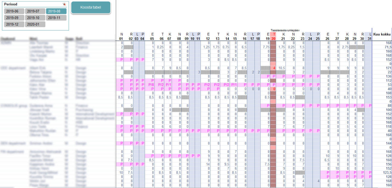
With that data in mind, we’re excited to publish this tutorial, inspired by one of our very own customers (Marek Laanbek, Beebole customer and financial controller at CES Estonia) who took the employee and project data in Beebole and turned it into a beautiful monthly automated timesheets report. While he used Beebole’s API to create his dashboard, we decided to go the route of report automation with Excel Power Query, also known as Get & Transform. You can watch the tutorial on YouTube here.
What is Excel Power Query?
As the Microsoft support site indicates, “Power Query is a data discovery and query tool, good for shaping and mashing up data.”
It is a powerful feature that allows you to import, manipulate, and transform data from a variety of sources, such as databases, text files, web pages, and other data formats, and then load that data into Excel for analysis and reporting. Power Query is part of Microsoft’s business intelligence (BI) suite and is often used for data preparation and cleansing tasks. It’s a valuable tool for anyone who needs to work with and manipulate data from various sources within Excel as it helps streamline the data preparation process, reduces the risk of errors, and enhances productivity when working with large datasets or complex data sources.
Time tracking tools that integrate with Excel
Beebole’s dashboards are powerful and make it easy to create multiple views for your timesheet data. However, we know many users are more comfortable working in Excel, which is why Beebole makes it easy to export your raw data from the app so that you can review and analyze it in any tool. Don’t miss our add-in for Excel that allows you to connect spreadsheets directly to your Beebole account. This simplifies building reports and analyzing data in Excel. If you’d like to see it in action, have a look at how to use Beebole for overtime cost analysis.
Beebole’s easy-to-use export feature and free Excel integration make them perfect complementary tools to work with your timesheet data. In this tutorial, we’re going to use Beebole timesheet data with Excel to create an automated employee time report dashboard. Of course, in order for this dashboard to be fully functioning, employees must actually fill out their timesheets! That’s exactly why we’ve put together this quick overview of examples of timesheet reminders and templates. You can learn more about other types of time tracking integrations here.
Taptu stopped wasting time on manual reporting—why haven’t you? The Australian IT consultancy connected Beebole with Office 365 and Xero to automate everything from timesheets to payroll. The result? A nearly hands-free workflow that scales with their business.
Follow Taptu’s footsteps if you’d like to:
⚡Eliminate error-prone manual reporting
⚡Keep timesheet, invoicing, and payroll data in sync automatically
⚡Free your team from admin so they can focus on clients
⚡Build a scalable operations workflow that grows with your business
Tutorial: Learn to build a time tracking dashboard in Excel
In the video below, we show you exactly how to build a time tracking dashboard in Microsoft Excel, a game-changer when it comes to understanding your time tracking data.
Create Your Own Powerful Time Tracking Reports
We'd love to show you the best reports for your business needs.
Step-by step guide: Building an automated time tracking dashboard
1. Download your Beebole timesheet data
First, we need to download the employees’ timesheet data from Beebole. After you log into your Beebole dashboard, find the Reports section on the right side. We need to create a report that gets data from Beebole to export.
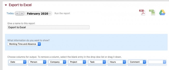
Then, let’s give our report a name. I set mine to “Export to Excel” to make it easy to remember. Then, let’s start playing with the fields that we want to include.
What works well for Excel is to grab every possible field you might need. If you don’t want to see that field in your Excel dashboard, simply exclude it from the report we’ll build later on. It’s better to include everything you might want to work with.
Excel works well with each row of data as its own “record.” That means each line should represent a single time entry. See the screenshot below for a suggested data view that works well for a dashboard. One optional setting: There’s a dropdown box labeled “What information do you want to show?” Switch between options like Working Time only and Working Time and Absences based on the purpose of your report.
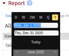
Finally, make sure to set the time period for your data. It’s best to download an entire year’s worth of data. That way, you can simply replace the file that Excel uses for the dashboard. You won’t risk duplicating records by downloading a week at a time, for example.
Now, it’s time to download our finished report. Click on the CSV button.
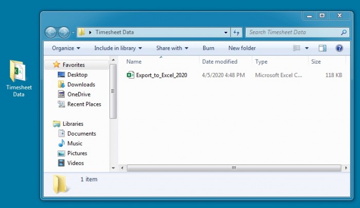
After that, create a new folder, then place your downloaded CSV file in it. We’ll tell Excel to watch this folder for timekeeping data.
2. Use Power Query in Excel to import data from a folder and automate the process
To work with the data in Excel, we need to point it to our Beebole data. We’re going to use a feature called Power Query to point Excel to a watched folder and keep the time report dashboard up to date.
Sure, you could simply copy and paste your timesheet data into the workbook. But this takes extra time to update and can be cumbersome. Remember, we want to automate this reporting process as much as possible.
To use Power Query to get your timesheet data, open Excel and choose Data > New Query > From File > From Folder. Then, browse to a folder on your computer.
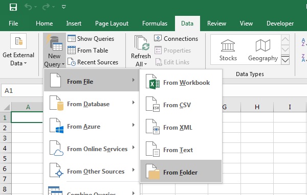
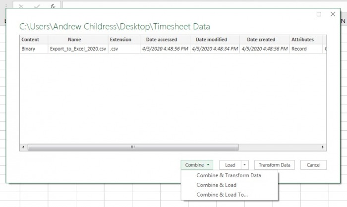
Now, point Excel to the folder that you created for your timesheet data. You’ll see a preview of the files that Excel uses in the future. Click the Combine and Load to dropdown so that Excel will automatically roll together all timesheet data you keep in the folder.
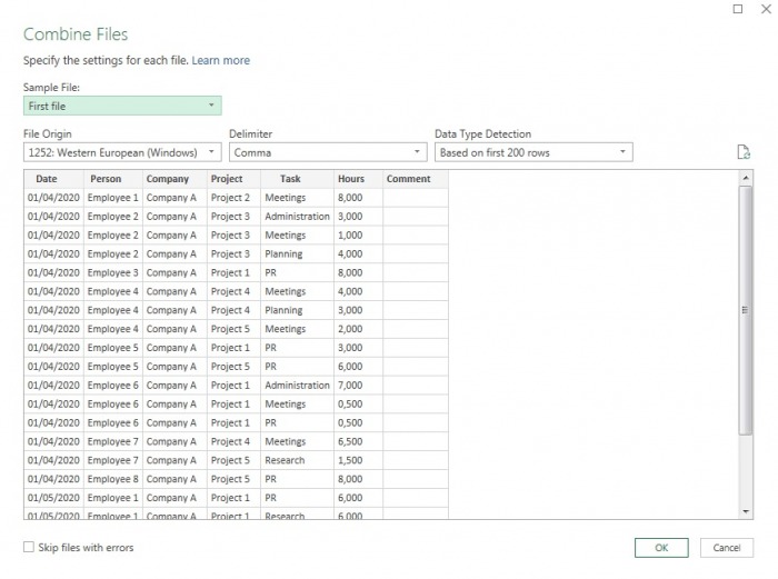
Excel will then show you a preview of the data rows that will be included in your report. Press OK to confirm.
Finally, we need to use the Load To option to make Excel “aware” of data so that we can work with it.
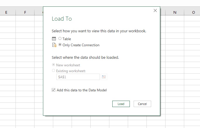
With this approach, we have Excel watching a monitored folder for new timesheet data. All that you have to do is replace the CSV with a new download from Beebole and click Data > Refresh All, and Excel is always up to date.
3. Use Power Pivot to manage large amounts of data
With the previous steps, we’ve laid the groundwork to work with our timesheet data. Excel is now watching a folder for the latest file and is ready for your data.
Now, we’re going to use a PivotTable to work with this data and put it into an interactive report. Specifically, we’re going to use Power Pivot, which magically works with the data that lives in the watched folder.
Power Pivot is an Excel add-in which can handle large volumes of data (millions of rows) from various sources and all of this within a single Excel file. According to Microsoft: “Power Query and Power Pivot complement each other. Power Query is the recommended experience for discovering, connecting to, and importing data. Power Pivot allows for powerful data analysis and data modeling in Excel and is great for modeling the data you’ve imported. Use both to mold your data in Excel so you can explore and visualize it.”
To add a pivot, go to the tab labeled Power Pivot > Manage. Next, click on PivotTable to place it in your Excel workbook. This is the gateway to working with our timesheet data.
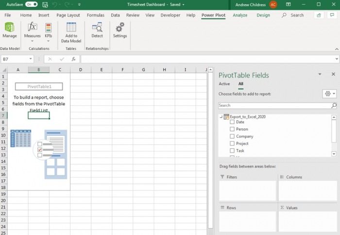
So far, we’ve taken steps that add a table that hooks to our timesheet data. Now, we can start building out our report.
4. Build the timesheet report with a PivotTable
We’re going to build a PivotTable based on our timesheet data. This is one of Excel’s most powerful features to work with data. In short, a Pivot helps you aggregate and summarize data in an easy-to-understand format.
Click inside the PivotTable box on the left side to show the PivotTable Fields menu. Think of this menu as a report builder. It points to your timesheet data, and you can drag-and-drop it into a report that stays up-to-date.
You’ll see rows for each of the data in the list, like Date, Person, Company, and Project. You’ll recognize these as the columns in our original dataset.
Below the field list, you’ll see four important boxes: Filters, Columns, Rows, and Values. Drag-and-drop fields into these boxes to show data in the report. The box that you drag a field to influences how it shows in the report.
Basically, if you drag a field like “Project” into Rows, it shows each project on its own row. Or, if you dragged it into Columns, each project shows in its own column. You can build a report in the format you need by dragging fields to the corresponding boxes.
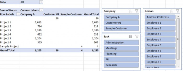
Here’s a suggestion for a sample dashboard.
Drag:
- Hours into the Values field
- Project into Rows
- Date into Filters
- Employee into Columns
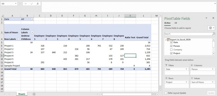
With this report, I can quickly see each project and how much time my employees are spending on them. It’s this type of dashboard that your boss and peers are sure to appreciate as they assess the workload.
If you want to filter the included dates for the data, click on the dropdown box at the top of our report. You can uncheck the dates that you want to exclude from your report.
PivotTables require experimentation. When you start to build them, start by asking: “what do I want to learn about my data?” We’ve built the framework to show timekeeping data, and now it’s your turn to decide how to create a report that’s most useful to you.
What works best for you? We want to hear about it.
Above all, we’d absolutely love to hear your thoughts. In addition to hearing whether this post was useful for you and your organization, we’d love to help answer any questions you have. Leave your questions or comments at the bottom of this post, and we’ll do our best to help. Our hope is that many of you will not only find this tutorial helpful, but you’ll also find it inspirational. We’d love to see what you come up with, so we can eventually put together a collection of everyone’s automated dashboards and reports to share with this community.
5. Slice and dice your report in Excel with slicers
A report like this is a great way to analyze what your team is working on in Excel. One last feature to check out is slicers.
A slicer is a way to filter the data that shows in your Pivot. It’s a point-and-click option to filter the data that shows in the pivot.
To add a slicer, click inside your Pivot, then go to Analyze > Insert Slicer. Tick the boxes for any fields you want to add a slicer for. As a general rule, it’s a good idea to add any fields that aren’t visible in the report as a slicer.
For example, I’ll add Company and Date. You’ll see new boxes that control the data that shows in the pivot.
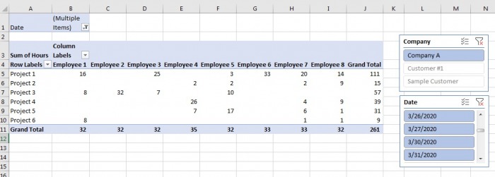
Slicers stack. So for example, this means that after you pick Company A, the dates will automatically adjust to only show dates relevant to Company A timekeeping.
Success in building your first automated report in Excel with Power Query
With the help of this tutorial, you now have an easy-to-refresh timesheet dashboard and instructions for creating useful reports to share with your team and management. Once you’ve taken the simple steps above to set everything up, just use the Data > Refresh All option each time you download data, and you’re ready to present. In conclusion, here’s a quick look at today’s main takeaways.
- When it comes to saving time and money, automation is key. Excel Power Query and the Beebole Timesheet add-in for Excel make automating reports possible. Once set up correctly, there is no need to tinker or toy with anything—your data will automatically display as you’ve designed it to.
- Excel Power Query is a data discovery and query tool that’s great for “shaping and mashing up data.”
- For an automated time tracking dashboard in Excel, make sure to find a tool that integrates with it seamlessly.
- First and foremost, decide which data is pertinent to you and your organization before creating your automated report, and remember to ask any questions you have below so that we can help.
- Use PivotTable and slicers in order to filter your data further.
- Share your automated dashboard and reports with us; we can’t wait to see what you come up with and to share the examples with this incredible community.
