How to use Google Sheets’ pivot tables, column stats, explore, & QUERY function
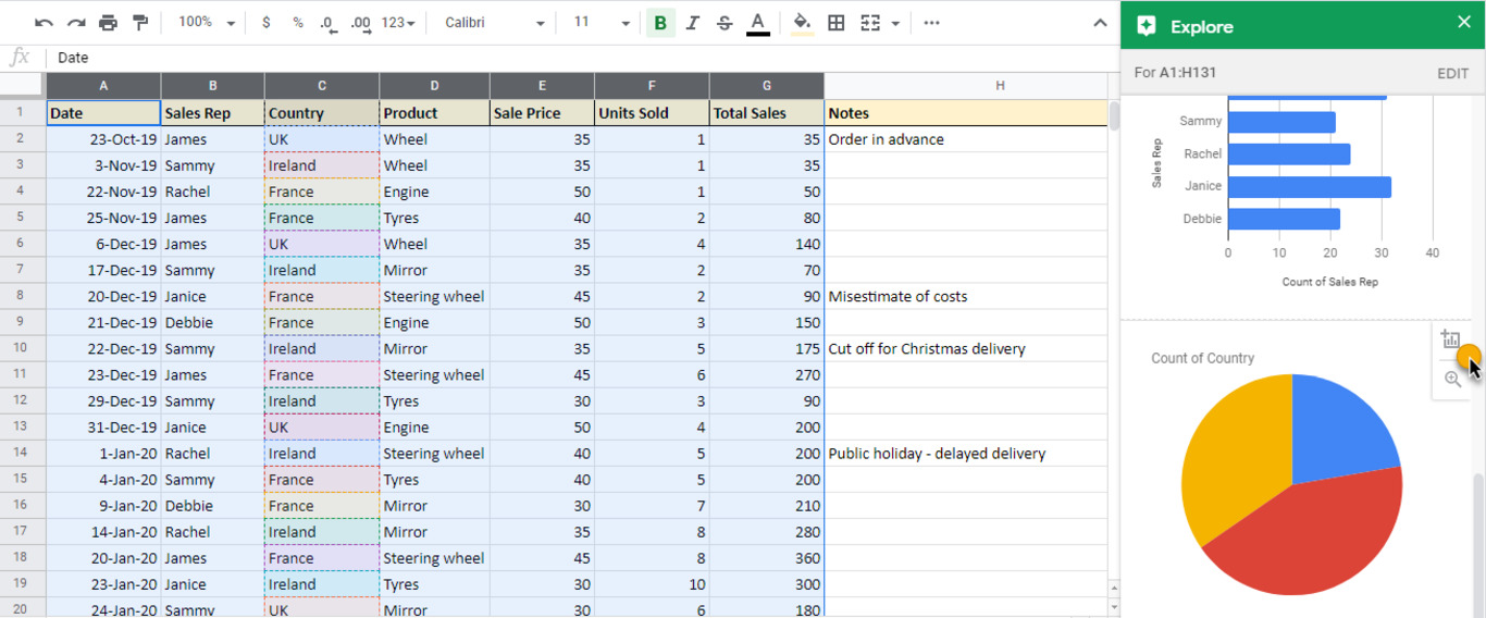

Table of Contents
Table of Contents
As a manager, perhaps you’ve wondered how to take your financial reporting to the next level or how to amp up your data analysis skills. Maybe you’ve got an important meeting coming up, or you’d simply like to wow the executives on your next run-through. Whatever the reason, this tutorial is sure to help. We’re going to look at some of Google Sheets’ most useful features to transform your reporting. That includes pivot tables, column stats, explore, and QUERY. Best of all? You’ll have the confidence to use them in your own work, starting today.
You can follow along with us by downloading this spreadsheet and following our step-by-step instructions.

Often juggling multiple projects at any one time, managers certainly feel the pressure when it comes to financial reporting. You’re probably used to writing and rewriting formulas, but what if there was a better and more convenient way to present your data? In this section, we’ll show you how to create a pivot table in Google Sheets in three quick steps. We’ll also share some tricks to analyze your data with ease.
Before we dive in, let’s cover some essentials.
Pivot tables allow you to analyze your data and present it back in lots of different ways. They’re used to summarize, group, sort, reorganize, or calculate data stored in your spreadsheet, all without the need for a formula.
Pivot tables are dynamic and interactive, helping you to quickly modify their outputs and easily digest the results.
If you’re working with data, you should be taking advantage of this clever feature. As a manager, you’ll be familiar with seemingly endless datasets. But having your figures presented in pivot tables will make analyzing data a breeze.
Now that you know the benefits of pivot tables, let’s go through the three steps to creating your own. Remember, you can follow along with the sample spreadsheet, noting each of the tabs as we go.
To select your source data, highlight the cells you want to include, or click anywhere inside your chosen tab to capture everything. You can find this under the ‘Source Data’ tab on the sample spreadsheet. For this example, select cells A1 to G131, then click Data > Pivot table, as shown in the screenshot below.

A dialogue box will appear and ask if you want this pivot table to be input into a new or existing worksheet. For the latter, be sure to choose which cell you would like to start from (for example, cell A1). For these examples though, we will input the pivot tables next to the source data in new tabs (for example, cell I1 as below).

The ‘pivot table editor pane’ appears on the right-hand side, and the blank pivot table placeholder on the left. You can find this in the ‘blank pivot table’ tab. Google Sheets automatically offers a few suggested Pivots to try, but for this tutorial, we’ll be creating examples from scratch.

To include the data you want to analyze, simply click ‘Add’ and choose the fields you need. Let’s assume you’d like to calculate the total sales from each of the sales reps.
For this, you would add ‘Sales Rep’ under ‘Rows’ as shown in the screenshot below.
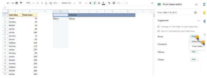
Now add ‘Total Sales’ under ‘Values’ as shown in the screenshot below.

The screenshot below shows you what your pivot table should look like (on the right), next to the relevant source data (on the left). You can also find this example in the ‘Pivot 1 – Sales by Rep’ tab.
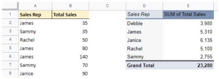
And there you have it. Three straightforward steps to creating your own pivot table in Google Sheets with no formula in sight!
Of course, there are many more features to explore, and pivot tables can vary in complexity. Did you know that with our add-on for Google sheets, you can combine your timesheet data with the power of Google Sheets and these very reporting features we’re diving into? Let’s explore some other ways to present our data through pivot table examples, using the sample spreadsheet as we go.
For a multi-layered report, you may want to add more fields and display more data in the one table. Let’s say you would like to compare the country against your original calculation.
For this, you would use the same fields as ‘Pivot 1 – Sales by Rep’ and add ‘Country’ under ‘Columns,’ as shown in the screenshot below.
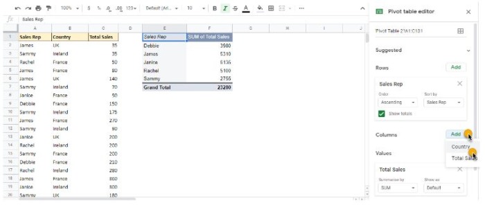
The screenshot below shows you what your pivot table should look like (on the right), next to the relevant source data (on the left). You can also find this example in the ‘Pivot 2 – Sales by Rep by Country’ tab.

Totaling numbers is most common, but sometimes it’s more interesting to review averages, counts, or percentages of our data. Perhaps you need to know the average sales in each location or the count of items by product for an inventory report, where the value is less important than a physical count. Sum, average, and count are different types of ‘aggregations.’
Using our example from ‘Pivot 2 – Sales by Rep by Country,’ let’s see the difference between summarizing by ‘SUM’ and summarizing by ‘AVERAGE.’
Under ‘Values’, click ‘SUM’ and choose ‘AVERAGE’ from the list, as shown in the screenshot below.

The screenshot below shows you what your pivot table should now look like (on the right), next to the relevant source data (on the left). See this example in the ‘Pivot 3 – Average Sales’ tab and compare it to ‘Pivot 2 – Sales by Rep by Country’.

Another handy aggregation is ‘COUNTUNIQUE,’ which you might use for counting the unique values in a list of data. This is different from ‘COUNTA,’ which just counts the rows, including any duplicates).
Note: Excel doesn’t have this feature, so you’ll only find it in Google Sheets.
Using a new example, let’s say you’d like to know how many sales reps you have for each country. ‘COUNTA’ will display the number of times that sales rep is mentioned in the data. ‘COUNTUNIQUE’ will ignore the duplicates and give you the accurate number.
To do this, under ‘Rows’ click ‘Country’, then under ‘Values’ click ‘Sales Rep’ and choose ‘COUNTUNIQUE’ from the list.
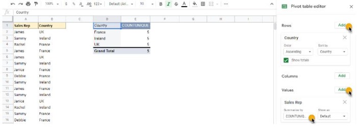
The screenshot below shows you what your pivot table will look like (on the right) alongside how this compares to ‘COUNTA’, with the relevant source data (on the left). You can also find this example in the ‘Pivot 4 – COUNTUNIQUE vs COUNTA’ tab.

Managers don’t always have time to create pivot tables to identify key trends, statistics, and anything that may stand out as a financial risk. They’re also responsible for ensuring the data their team is collecting is accurate. As you’ll know all too well, one small but undetected mistake can have disastrous results. In this section, we’ll show you how to utilize this brand new feature to check your data in a matter of seconds.
Released in October 2020, column stats gives a quick overview of an entire column in just two clicks. It provides insights so you can see a column’s values in an accessible format, and helps you analyze your data quickly and prepare your input data before creating reports.
Note: Excel doesn’t have this feature, so you’ll only find it in Google Sheets.
Let’s go through the two steps for using column stats to get a quick glance at your data without having to create a pivot table. For this feature, follow along with the sample spreadsheet using the ‘Data for Column Stats’ tab. Note that it includes some deliberate errors to better help you understand how it works.
First, decide which column you wish to view. For this example, we will use the ‘Product’ column C. Click Data > Column stats, as shown in the screenshot below.
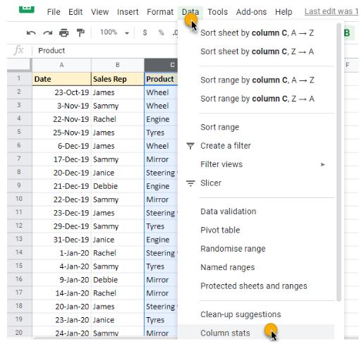
The values for this column will now be displayed on the right-hand side ready for analysis, as shown below.
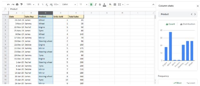
Let’s say you’d like to know what types of products are currently being sold. This column breakdown allows you to see the list of products and if any incorrect data has made its way into your spreadsheet. In the example below, you can see ‘Mrror’ is an item that should not be included in this column.
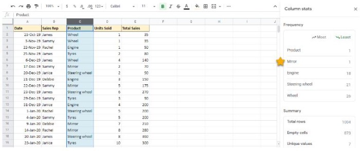
You can now toggle between the other columns to see their stats on the right-hand side, as shown below.
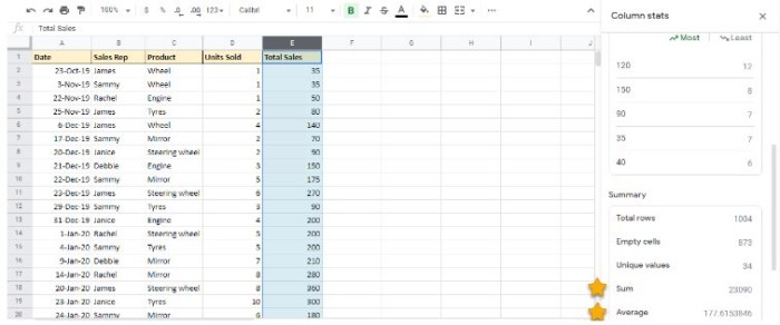
This breakdown of values for column E allows you to see the average and sum total of sales at a glance. All of this data and without any need for formulas or pivot tables!
With a consistently busy work schedule, every manager is keen to know the latest ways to save time and improve their efficiency. While column stats and pivot tables help you create and upgrade your reporting, what happens when you need answers immediately and you’re not sure how to present them?
That’s where Google Sheets’ explore feature comes in. Whether you’re struggling with preparing financials in an attractive audience-friendly format, or you need to identify the trends in the last quarter’s sales, this one-click wonder will be your new best friend. In this section, we’ll show you how to use the explore feature to instantly gain insight from your data with the impressive power of AI.
So what’s so great about explore? The explore feature allows you to ask questions about your data as it automatically analyzes everything in your spreadsheet, making visualizing and presenting the information even more straightforward. It pre-suggests charts and pivot tables for your data so you can save time from manually creating them yourself.
As the quickest of the three features we’ve discussed in this tutorial, explore offers an effortless way to examine large datasets in just one click.
Let’s walk through the various ways explore can help you find the answers you need to enhance your reporting further. For this feature, you can follow along with the sample spreadsheet using the ‘Source Data’ tab.
To launch the explore feature, select the data you’d like to focus on (for example, A1 to G131) and click on the ‘Explore’ icon at the bottom-right of your screen, as shown in the screenshot below.

Explore will then display a list of suggestions on the right-hand side, including ‘Answers,’ ‘Formatting,’ ‘Pivot tables’, and ‘Analysis,’ as shown in the screenshots below.
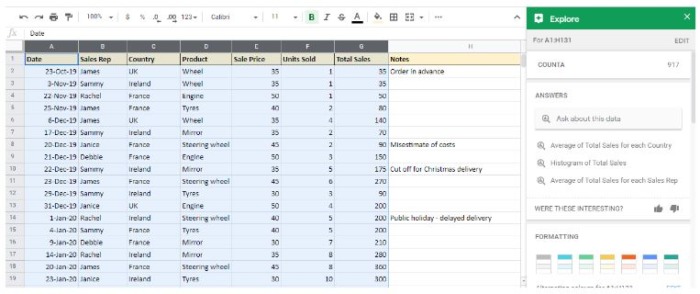
To see more suggestions, click ‘MORE’, as shown below.

When you find something you want to use, click the ‘Insert’ icon, as shown below.

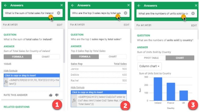
Using the search function under the ‘Answers’ section, type in the questions you have about the data. Let’s imagine you’d like to know the following;
1) “What is the sum of total sales for Ireland?”.
2) “Who are the top 3 sales reps by total sales?”
3) “What are the numbers of units sold by country?”
The screenshots below show how these questions would be displayed as answers, complete with suggested ways to present and analyze the data.
When you’re working with financials, it’s easy to get frustrated with the amount of data in one spreadsheet, especially when you only need to look at specific subsets. Imagine you have a worksheet with thousands of figures, but you would like to generate a report with just a couple of products to see their sales progress. Maybe you also need to include the sales person and the location but you need them in a different order from the source data. QUERY is the formula way to do this.
This clever feature allows you to use SQL-like code (‘Structured Query Language’ is a programming language which operates using statements) inside a formula to manipulate your data.
Rather than having to copy and paste your data, and write formulas to pick out the relevant information, QUERY offers you a flexibility and robustness that is more sophisticated than anything else that Google Sheets can produce.
Note: Excel doesn’t have this feature, so you’ll only find it in Google Sheets.
Let’s go through the step by step process for using QUERY as a beginner. For this function, you can follow along with the sample spreadsheet, noting each of the tabs as we go.
QUERY uses the following format; =QUERY(data, query, [headers]). Entering [headers] is optional as Google will usually guess which ones to use.
First, click in an empty cell in your worksheet and type ‘=QUERY’, then ‘(‘ and then highlight the data range you’d like to use (for example, A1 to F131), as shown in the screenshot below.

Let’s assume you’d only like to analyze the units of products sold by the sales reps. For this, you would enter the ‘query’ as “select B,D,E”, (referencing the column letter) as shown in the screenshot below.

Now click ‘enter’ on your keyboard.
The screenshot below shows you what your QUERY should look like (on the right), next to the relevant source data (on the left). You can also find this example in the ‘QUERY 1 – SELECT’ tab.

You can also retrieve any combination of columns in any order you like (even non-sequential) for example “SELECT D, F, C, A” would work just fine.
Let’s say you’re only interested in the units of wheels sold by the sales reps. For this, you would enter the ‘query’ as “select B,D,E where D = ‘Wheel’”, as shown in the screenshot below.

Now click ‘enter’ on your keyboard.
The screenshot below shows you what your QUERY should look like (on the right), next to the relevant source data (on the left). You can also find this example in the ‘QUERY 2 – SELECT + WHERE’ tab.
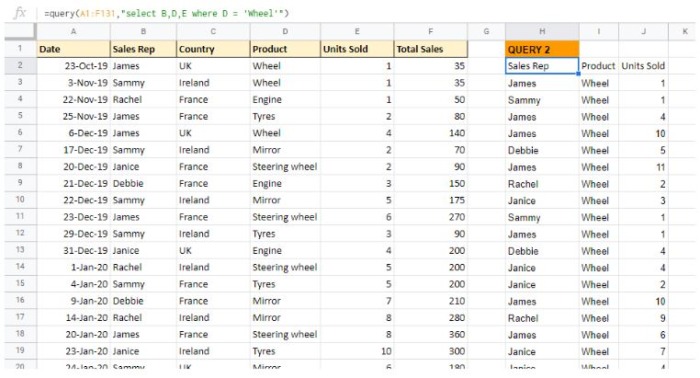
You can see that WHERE can refer to any column, not just the ones in your output table (e.g. WHERE C=”UK” would return just those rows).
Let’s say you’re only interested in the units of wheels sold by the sales reps when the units sold is greater than 5. For this, you would enter the ‘query’ as “select B,D,E where D = ‘Wheel’ and E>5”, as shown in the screenshot below.

Now click ‘enter’ on your keyboard.
The screenshot below shows you what your QUERY should look like (on the right), next to the relevant source data (on the left). You can also find this example in the ‘QUERY 3 – SELECT + WHERE + AND’ tab.

Although QUERY goes a lot further with more functions like ‘PIVOT’ and ‘ORDER BY’, the majority of the time, SELECT and WHERE provides the required breakdowns for financial analysis. Say goodbye to feelings of frustration and copy and paste horror stories; With this nifty, robust feature, you’ll be a master of data manipulation in no time.
In this tutorial, we’ve discussed four of Google Sheets’ expert reporting and analysis features; pivot tables, column stats, explore, & QUERY function. Whether you’re a novice still learning the ropes or a veteran of all things spreadsheets, we hope these quick wins help you upgrade your financial reporting and get you that all-important ‘wow’ from the team.
Is there a feature we’ve discussed in this tutorial that you’d like to learn more about? Let us know in the comment section below.
–
This article is part of our tutorial series, where we often invite spreadsheet experts to share their expertise in thoughtful, actionable ways that managers can start using today. If you’re more comfortable in Microsoft Excel, don’t miss 5 hacks with Excel Power Query, or how to build an automated time tracking report with Power Query.
–
In The CFO Journal we talk to Chief Financial Officers from diverse sectors and backgrounds about their insights, experience, and advice for other professionals and aspiring CFOs. In this installment, Giulia George tells us about being a female executive at a fast growing Sydney startup. Who is Giulia George? Where: Local Measure is an independent software […]
We all know that employees yearn for constructive performance reviews. We also know that managers often find feedback hard to give. The fact is, whether it comes in the form of a positive evaluation or constructive criticism, reviewing performance is key to employee engagement, development and the growth of your business. It can even help […]
Absence days in the workplace are prevalent regardless of schedule, sector, or level. It’s just another moving piece of HR and the working world. That’s why it’s essential to understand your employee absence rate and know how to calculate it. Are you aware of the impact that absence days have in the workplace? Is your […]