Tips for better business intelligence reports on Beebole


Table of Contents
Table of Contents
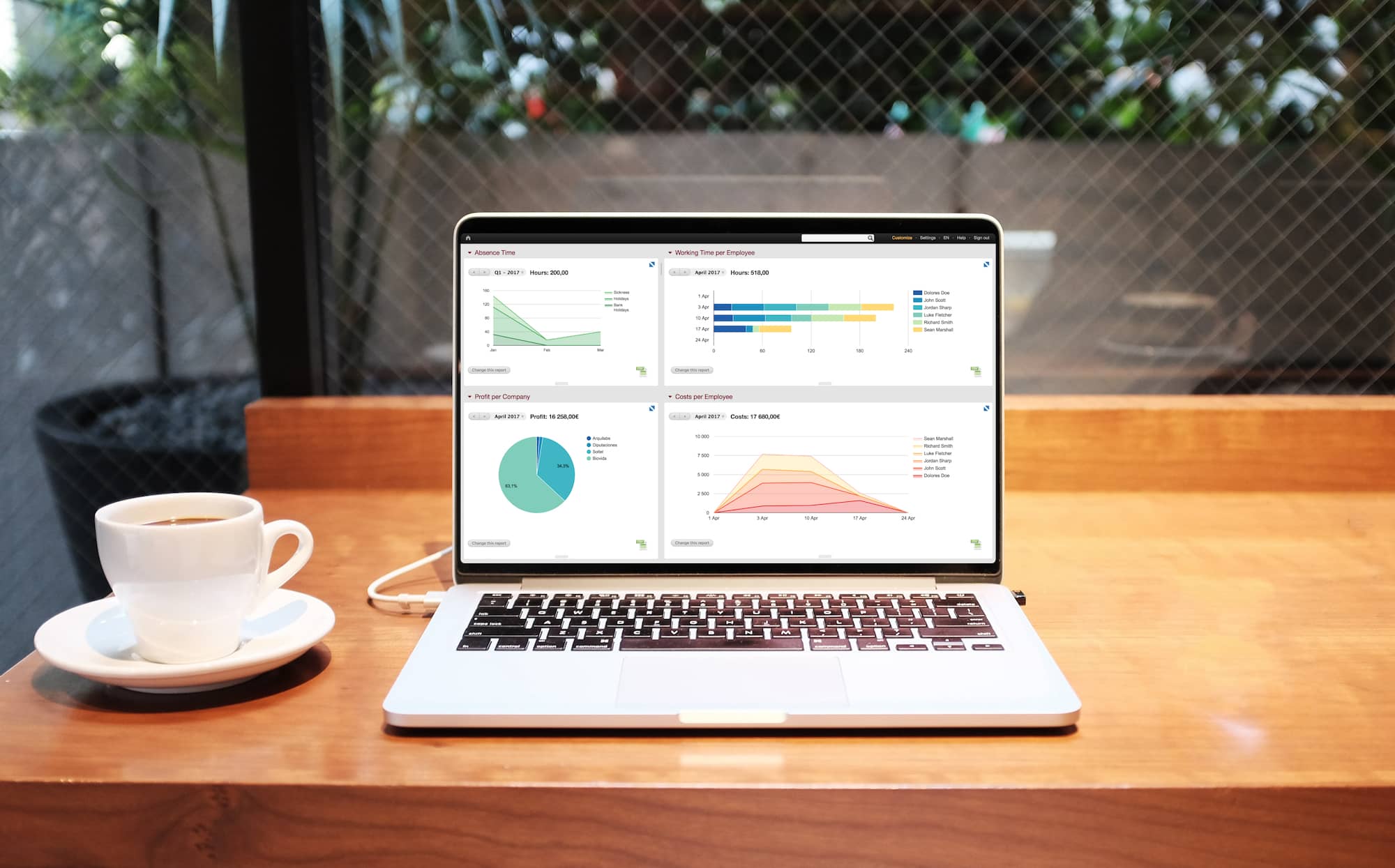
You may already know that Beebole offers the most flexible, customizable timesheet reports of any employee time tracking software. Create configurable tables, charts, and graphs on employee hours, overtime, projects, budgets, profit margins, costs, and much more. Build and save as many time tracking reports as you need and create a personalized KPI dashboard. Your time data is a treasure trove of information that can be used to build valuable business intelligence reports. But, there are some aspects of Beebole reports that you may not know about and are yet to take advantage of. Let’s take a look at some of our lesser-known reporting features that may come in handy for you and your team.
Exporting reports is among the most requested and used reporting features, but we still find that many users don’t know about all the ways you can export a time tracking report. At Beebole, we firmly believe that you are the owner of your data and should have total control over it, which is one of the reasons why we currently offer exports in four different formats: as a pdf, csv, Google Drive spreadsheet, or to Microsoft OneDrive.

To export, simply run a report and then click on the corresponding icon in the Reports module. Note that the Google Drive and Microsoft OneDrive exports are only available to Google Suite and Microsoft email users, respectively. You can also export data from the Chart & Table module as a csv by clicking the icon in the bottom right corner of the module.
If you are looking to further analyze or manage your time tracking data, or even to automate and share a weekly timesheet report, don’t forget you can also use the free Google Sheets add-on or Microsoft Excel add-in. Both are a great way to take your business intelligence reports to the next level, create automations, and consolidate your employee timesheet data with other data sources. You can also learn more about working with your time data in Excel in our tutorials series.
In general, various types of time tracking integrations can be a huge plus when it comes to running the right reports and understanding your data.

You may be exporting reports for presentations or to share with clients and colleagues, but there is another quick and easy way to present a time report without having to leave the Beebole dashboard. To view charts and graphs in full screen, just click the arrow icon in the top right corner of the Chart & Table module. What’s more, charts are still fully interactive and editable in full screen, so you can filter and drill down while presenting. This seemingly simple feature makes it that much easier to explore and collaborate on reports in meetings and presentations.

We all learned in grade school that choosing the correct unit for what you want to measure is key. You probably don’t have a good sense of how far 6 million centimeters is, because centimeters isn’t an appropriate unit of measurement for this much distance. The same can be said for time reports. Depending on what you are looking to measure, reports of hours worked can become confusing and useless when run for an extended period of time. For example, it may not be as helpful to know that an employee has worked 520 hours as it is to know they’ve worked 65 days.
To run reports using days rather than hours, define the number of hours per working day in your schedule settings. This feature is also helpful if you want to require employees to track a certain number of hours per day. Then, simply add a Days column to any of your reports using the drop-down list.

In Beebole, groups can be used to create categories to further organize employees, companies, projects, etc., and to add conditions to your business intelligence reports. Groups are usually things like departments, office branches, employee types, etc. and account administrators can create them using the Groups Settings module on the Settings page.
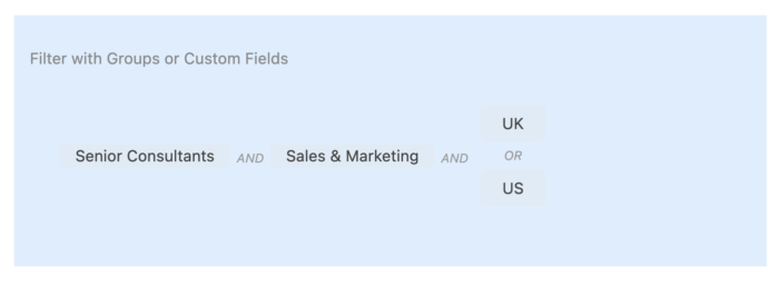
To use groups in reports, start by clicking on “Add a group to filter data” and select a group folder or any specific group within a folder. Create AND/OR conditions by clicking on the group box and selecting the condition and group you would like to add. Repeat the process to add as many groups and conditions as you’d like. For example, you can create a report that includes everyone in Sales and Marketing from the UK or USA office who is also a Senior Consultant.

This is just one example of how you can use groups to filter reports, but we have been amazed by how some Beebole users have used groups to add literally dozens of dimensions to their timesheet reports.
You can add a remarkable amount of detail to your charts and tables and really dive deep into your time tracking data using steps. Once you’ve configured a report using the Chart & Table module, add and customize additional layers of information to view data in greater detail. To add steps to a chart or table, or to modify the conditions of a step, just click “Change this report”. Then, you can edit each step or click “Add a step to drill down” to add another layer.

For example, if you are viewing a report of hours worked per client, you may click on a client to view the hours worked on each project for said client, then click a project to see the hours worked by each employee for said project, and finally click on an employee to see the weekly profit ratio of their work on said project over time. This is one example of how you can use steps, but the possibilities for nested reports are endless. If you need help building the perfect report, don’t hesitate to contact us using the chat icon in your dashboard.

If you’ve made it this far, ask yourself: am I getting the most out of my time tracking data? Here, we’ve covered just a few of Beebole’s reporting features, but there is so much more you can do to unlock valuable insights and use the tool to its full potential. We are always happy to help, so please reach out to us to discuss your specific use case.
Did you know that your team is 75% more likely to watch a video than to read documents, emails, or web articles? A growing number of companies both large and small are using video in their internal communication (IC) strategy. With Beebole’s custom module you can easily use video to engage and inform your team. […]
Mobile web apps (known as Progressive Web Apps or PWA) can be a cheaper and totally viable replacement to native apps in many domains. As it’s been proved elsewhere, native apps require a costly launch and maintenance cycle. Google is betting strong on PWAs by implementing Service Workers and although iOS is not reacting that […]
Timesheet approvals become effortless when automated with Beebole and Zapier, reducing inefficiencies by sending managers timely reminders to complete their reviews. We’ll guide you through an automation with Zapier that ensures your approval process stays on track, preventing delays in payroll and improving overall team accountability. On time, every time: why reviewing and approving time […]