- Everything if you are an administrator
- Your team’s data if you are a team leader
- Your projects’ data if you are a project manager
- Your own data if you are an employee or contractor
Using the Reports Module
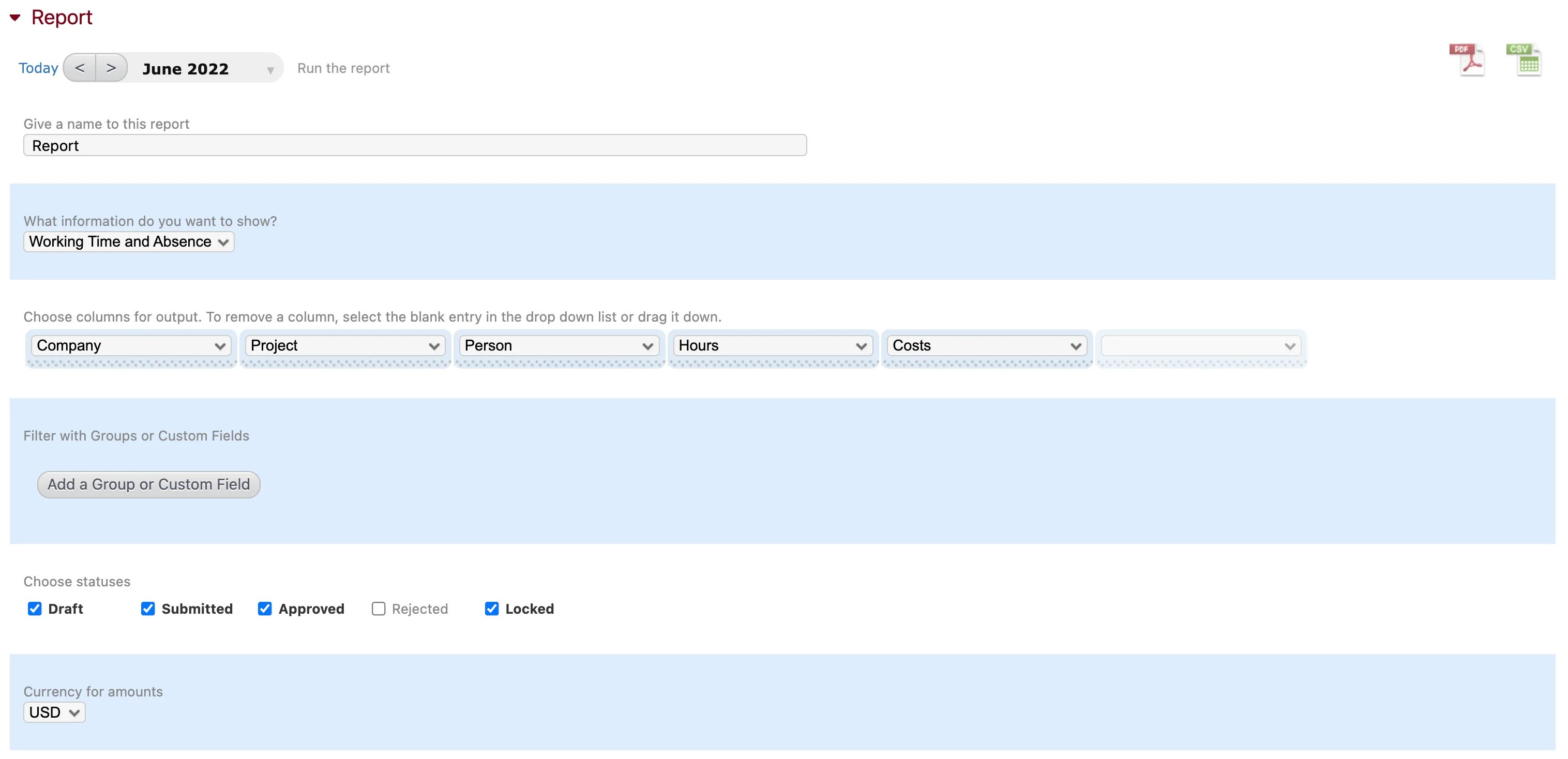
- Click “Change this report”. You can start by giving the report a name, which is handy if you have multiple reports on a single page.
- Select the type of information you want to display from the first dropdown menu. This could be absences, working time, both working time and absences, or absence quotas.
- Add, remove, and edit the columns. To add a column, fill in the blank column on the right hand side using the dropdown menu. To delete a column, select the blank field from that column’s dropdown menu, or click and drag the column away. You can also click and drag the columns sideways to reorder them. In each column you can choose from an extensive list of available data. All of the data types available in the Reports module are listed below.
- Click “Add a Group or Custom Field” if you want to add additional filters using your groups and custom fields.
- Select the status of the recorded time that you want to include in the report: draft, submitted, approved, rejected, or locked.
- Reports are shown in the currency configured for your account by default. However, if you want to change the currency for a specific report, you can do so using the “Currency for amounts” dropdown menu.
- Click “Run the report” to view the report you have just configured. You can change the time frame shown by clicking on the date range at the top of the module and toggle backward and forward in time using the arrow buttons.
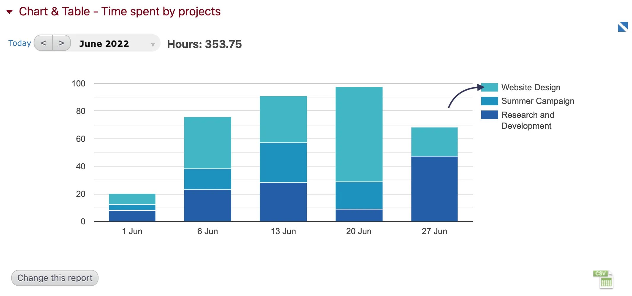
- If you use the Reports module on any company, project, subproject, task, absence, or person’s page it will only display data related to that specific entity.
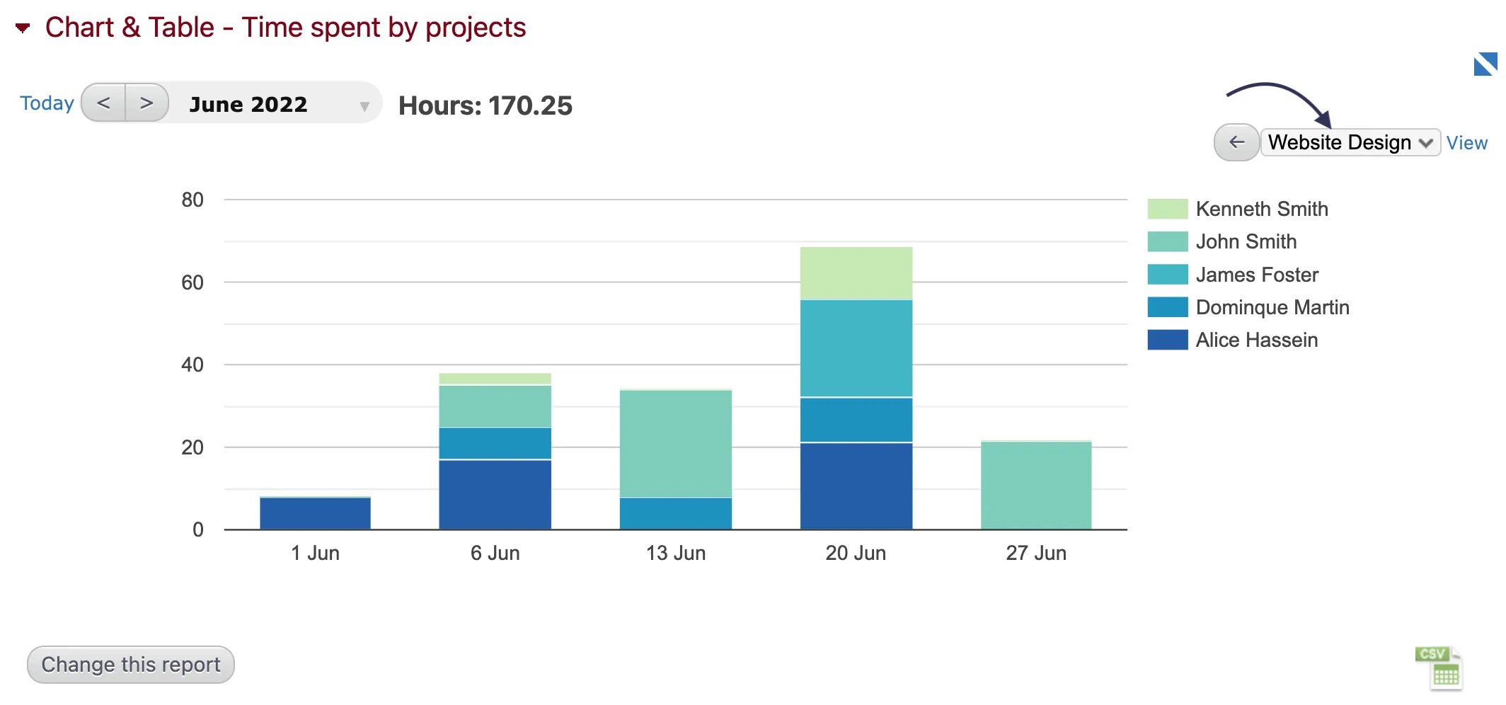
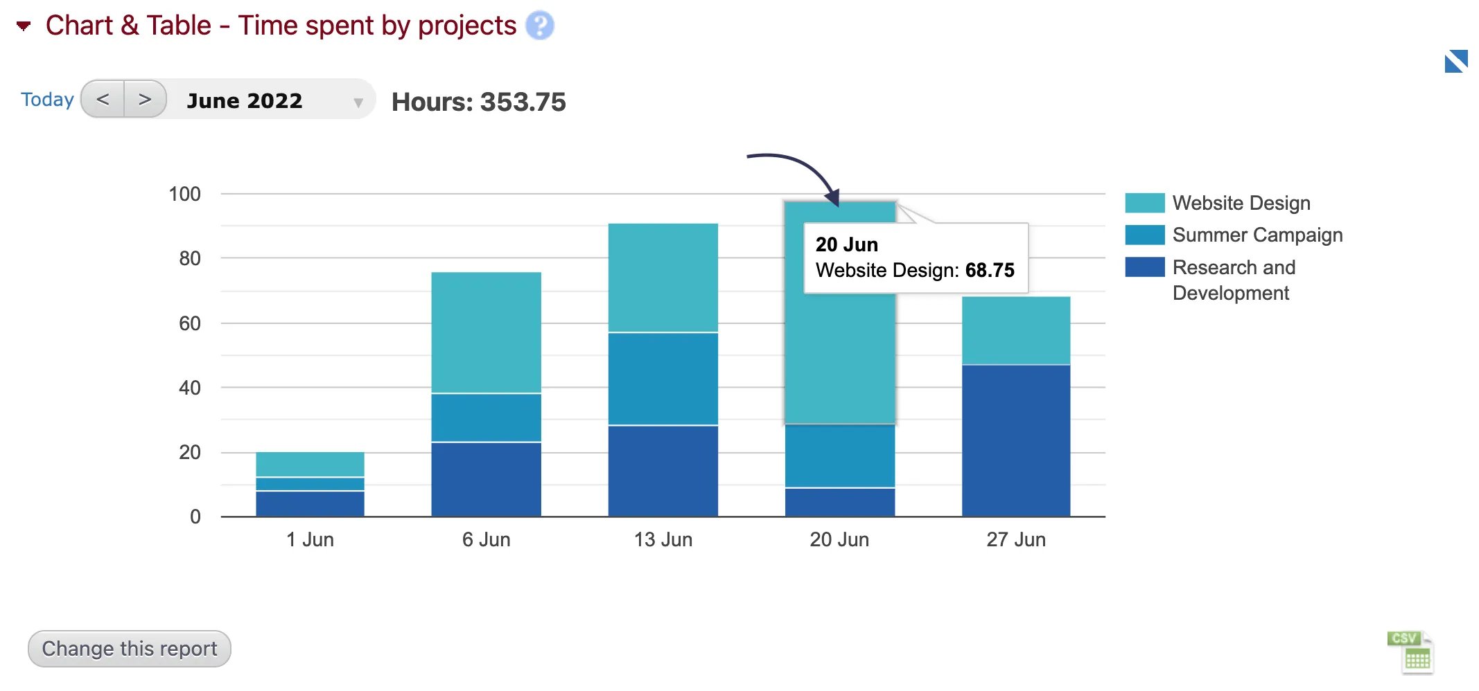
- Most entities shown in a report are clickable. Clicking on one will automatically filter the report results to only show time entries for that entity. For example, if you have a report showing multiple projects, clicking on one of them will filter the report and only show you data for the selected project. Click “All hours” at the top of the module to return to the view of all data.
Data available in the Reports module:
- Absence: the absence name.
- Absence ID: the absence ID, which would be an automatic ID or, if defined, the ID from the Absence Details module.
- Activity: will display a concatenation of the company name, project name, and subproject name or the absence name.
- Billable - Ratio: the % of billable hours for the row.
- **Billable Utilization %: **the % of billable hours for an employee.
- Billable / Non-Billable: will split the hours recording in billable and non-billable time and will display “billable” or “non-billable”.
- Billing: the total billing for the row.
- Billing - %: the % of billing that the row represents compared to the total billing for the report.
- Budget: budget information defined in the Budget module. The budgets are time independent and won’t be impacted by the time frame selected.
- Business days: number of working days for the selected timeframe, ie the number of days in the timeframe minus the weekends and holidays.
- Business days remaining: number of business days for the selected timeframe minus the number of days worked.
- Business hours: number of working hours for the selected timeframe, ie the number of hours in the timeframe minus the weekends and holidays.
- Business hours remaining: number of business hours for the selected timeframe minus the number of hours worked.
- Comment: the comment/note of a time entry.
- Company: the company name.
- Company ID: the company ID, which would be an automatic ID or, if defined, the ID from the Company Details module.
- Costs: the total cost for the row.
- Costs - %: the % of the cost that the row represents compared to the total cost for the report.
- Daily Cost: the average cost calculated for a day. (The conversion between hours and days is done in the Timesheet Settings module).
- Daily Rate: the billing rate calculated for a day. (The conversion between hours and days is done in the Timesheet Settings module).
- Date: the date of the time entry.
- Days: the time entries expressed in days. (The conversion between hours and days is done in the Timesheet Settings module).
- Groups, Custom Field: groups or custom field values defined for a row (for example, a department for an employee).
- Hourly Cost: the average cost per hour for a row.
- Hourly Rate: the average billing rate per hour for a row.
- Hours: the time entries expressed in hours.
- Hours - %: the % of hours that the row represents compared to the total hours for the report.
- Is working: “True” if the employee currently has a timer running at the moment of the report.
- Month: the month of the time entry, displayed as YYYY-MM.
- Overtime/day: the amount of hours above the number of hours per week defined in Timesheet Settings + hours worked on weekends and holidays.
- Person: the person’s name.
- Person ID: the person ID, which would be an automatic ID or, if defined, the ID from the Person details module.
- Profit: the billing - cost for a row.
- Profit - %: the % of profit that the row represents compared to the total profit for the report.
- Profit - ratio: the % of hours with profit for the row.
- Project: the project name.
- Project ID: the project ID, which would be an automatic ID or, if defined, the ID from the Project details module.
- Status: draft, submitted, approved, rejected, or locked.
- Subproject: the subproject name.
- Subproject ID: the subproject ID, which would be an automatic ID or, if defined, the ID from the Subproject details module.
- Task: the task name.
- Task ID: the task ID, which would be an automatic ID or, if defined, the ID from the Task Details module.
- Time End: the end time of a time entry (when using the daily view in the Timesheet module).
- Time Start: the start time of a time entry (when using the daily view in the Timesheet module).
- Week: the week number.
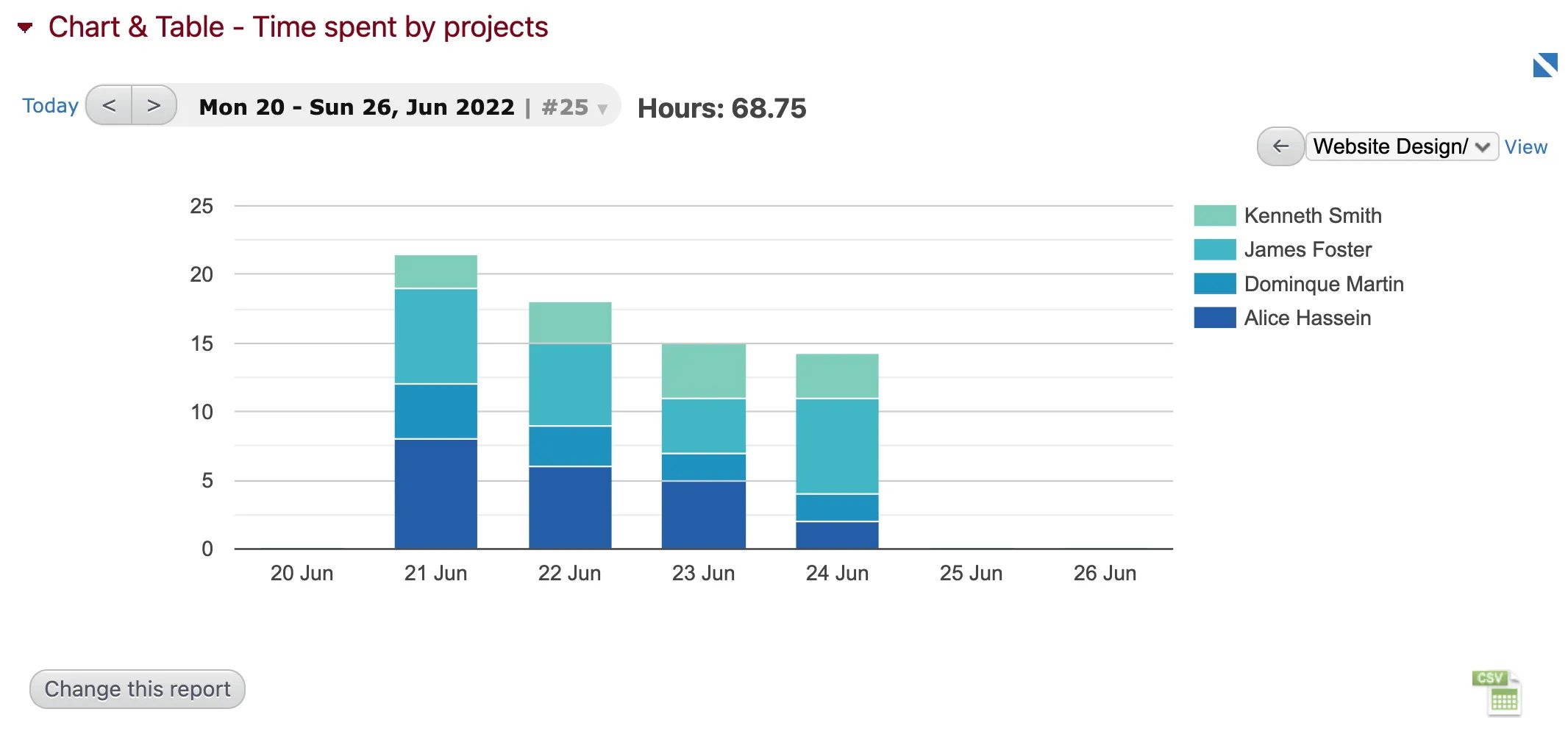
Using the Chart & Table* *Module
- Click “Change this report”. In the first dropdown menu, labeled “Choose another report..”, you can select from a list of existing standard reports (e.g. costs by company, profitability by project, time spent by tasks, etc.). Even if you want to create your own customized chart, it’s usually easiest to start with one of these standard reports and modify it accordingly.
- Give your chart a name. This is useful if you are adding multiple charts and graphs to a single page.
- Choose the status of the time (draft, submitted, approved, rejected, locked) and the type of information (working time, absences, or both) that you want to include in the chart.
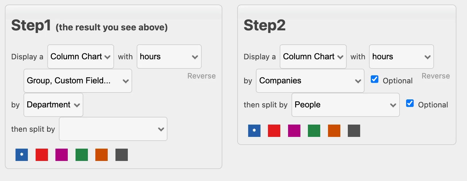
- Click “Add a step to drill down” to create the steps for your chart. You can include as many steps as you want, each one being a more detailed view of the previous.
- Choose the chart type from the first dropdown menu (area chart, column chart, bar chart, pie chart, or table).
- Select the units (days, cost, hours, etc.) and the first data type (absences, tasks, companies, etc.) from the next two dropdown menus. These first two steps will result in something like “Display a column chart with hours by projects”. You can click “Reverse” to switch the axes.
- If you’d like, you can choose a second data type from the dropdown menu labeled “then split by”. This is a kind of third axis that will add additional data to the chart. This option is not available on pie charts.
- Add as many steps as you need by clicking “Add a step to drill down”. Once you have finished configuring the chart, click “Run the report”.
Tips for Better BI Reports
Learn how to take advantage of all of Beebole’s reporting features and gain business intelligence
Using Groups and Custom Fields in Reports
Groups and custom fields can considerably expand your reporting capabilities by using them to filter results. You will be able to view data by department, country, external ID, or any other group hierarchy or custom field that you have created. In the*** Report***** module**, when creating or changing a report, click the “Add a Group or Custom Field” button. A list of all the existing groups and custom fields will appear. You can select as many as you want to filter data in the report. To remove a filter, click the red “X” in the top left corner of its name. You can also further refine a filter by adding “AND” or “OR” conditions. The “AND” condition means that all entities displayed in the report must be assigned both groups/custom fields at the same time. The “OR” condition means that all entities displayed must be assigned to any one of the groups/custom fields selected. For example, a report with the filter shown below will only show data for senior consultants in sales & marketing who are working at either the UK or the US office: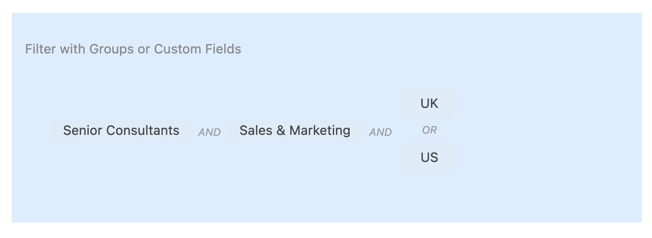
- Person
- Absence
- Task
- Subproject
- Project
- Company
Tracking Overtime
Beebole does not have a dedicated overtime module. Rather, overtime is tracked via reports. To track overtime, first you must set a number of “Hours per day” and “Hours per week” in the Timesheet Settings module. You can then add the column “Overtime/day” and “Overtime/week” to any of your reports. This will automatically include any hours worked on weekends or holidays. Remember that weekends can be configured in the Localization module and holidays in the Holidays module.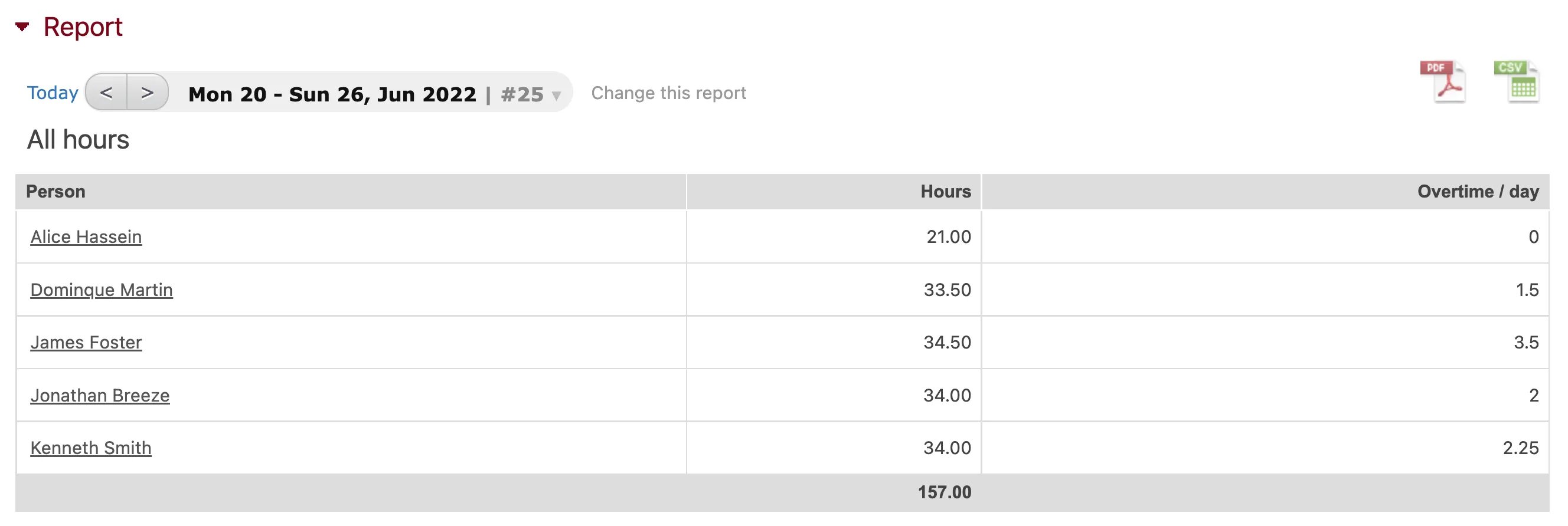
Exporting Your Data, Charts, and Reports
You can export your timesheet data to a PDF, spreadsheet, Microsoft OneDrive, or to Google Drive using the Report module. This is especially useful if you want to share branded reports with your customers, print timesheet data to submit to a manager, or build a spreadsheet report with a specific set of columns. Once you have created a report you want to export using the Report module, select the desired export format by clicking one of the icons in the top right corner of the module. Note that Google Drive and OneDrive exports are only available for Google Suite (Gmail) or Microsoft email (Office 365, Skype, Yahoo, etc.) users, respectively. You can also export the data from a chart or table using the Chart & Table module. To do so, click on the CSV icon in the bottom right of the module. Finally, you can export your configuration data to a spreadsheet*** ***using the Account module. Almost all of your account configuration data will be available in the dropdown menu under “Download your data”. NOTE: When opening a CSV file exported from Beebole, your spreadsheet editor may display the data in a single column. This is usually due to discrepancies in the value separator used (eg ”,” versus ”;”). To resolve this, go to the Localization module in your Settings screen. Here, change the “List separator for exports” from a comma to a semicolon. Alternatively, you can change the list separator under the regional settings on your computer.Exporting Your Data to QuickBooks
Hours recorded in Beebole can be exported as a Timer IIF file and imported to QuickBooks for Windows. Start by setting up the QuickBooks export in your Beebole account:- Go to the Settings screen and add the QuickBooks Settings module to your screen by clicking “Customize” in the top right corner and dragging and dropping the module anywhere.\
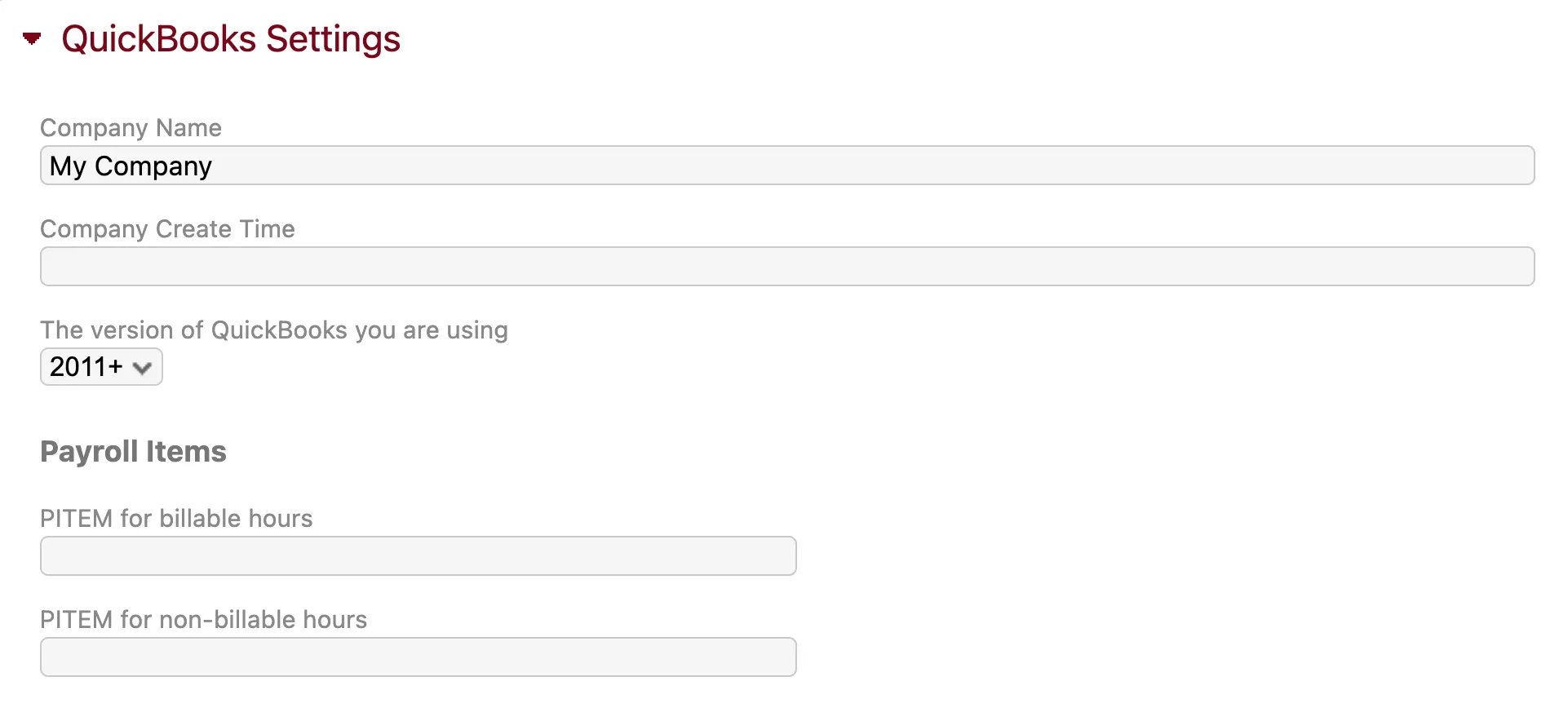
- In the QuickBooks Settings module, fill in the Company Name, Company Create Time, and QuickBooks version exactly as they appear in your QuickBooks account. You can find the Company Create Time by going to File > Utilities > Export > Timer Lists and downloading the IIF file. The Company Create Time should appear in the second line.
- If you are using QuickBooks Payroll fill in the PITEM (payroll item) for billable hours and PITEM for non-billable hours.
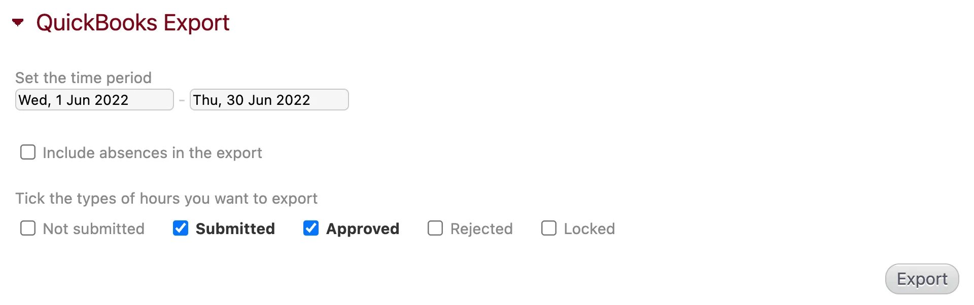
- Next, add the QuickBooks Export module to your Settings screen. Select the time period and status of the hours you want to export, and click the “Export” button. This will download a Timer IIF file.\
- To import this file to QuickBooks 2006-2007, go to File > Import > Timer Activities in your QuickBooks account and select the file you exported from Beebole. The same operation can be performed in QuickBooks 2008-2011 by going to File > Utilities > Import > Timer Activities.
| BEEBOLE | QUICKBOOKS |
|---|---|
| Company / Customer | Client |
| Project | Job |
| Subproject | Sub-job |
| Task | Service |
| People | Employee |
- QuickBooks Mac is not supported, as it does not allow time imports.
- The QuickBooks integration is not available on free accounts.
- Absences are not exported by the QuickBooks Export module.
Creating Branded Reports
The *Export Setting *module will allow you to configure the format of your PDF exports, which can be used to create branded reports. Administrators can find the Export Settings module on their Settings page. Here you can choose a Letter or A4 paper format, add a letterhead to the first page, and add a footer to each page.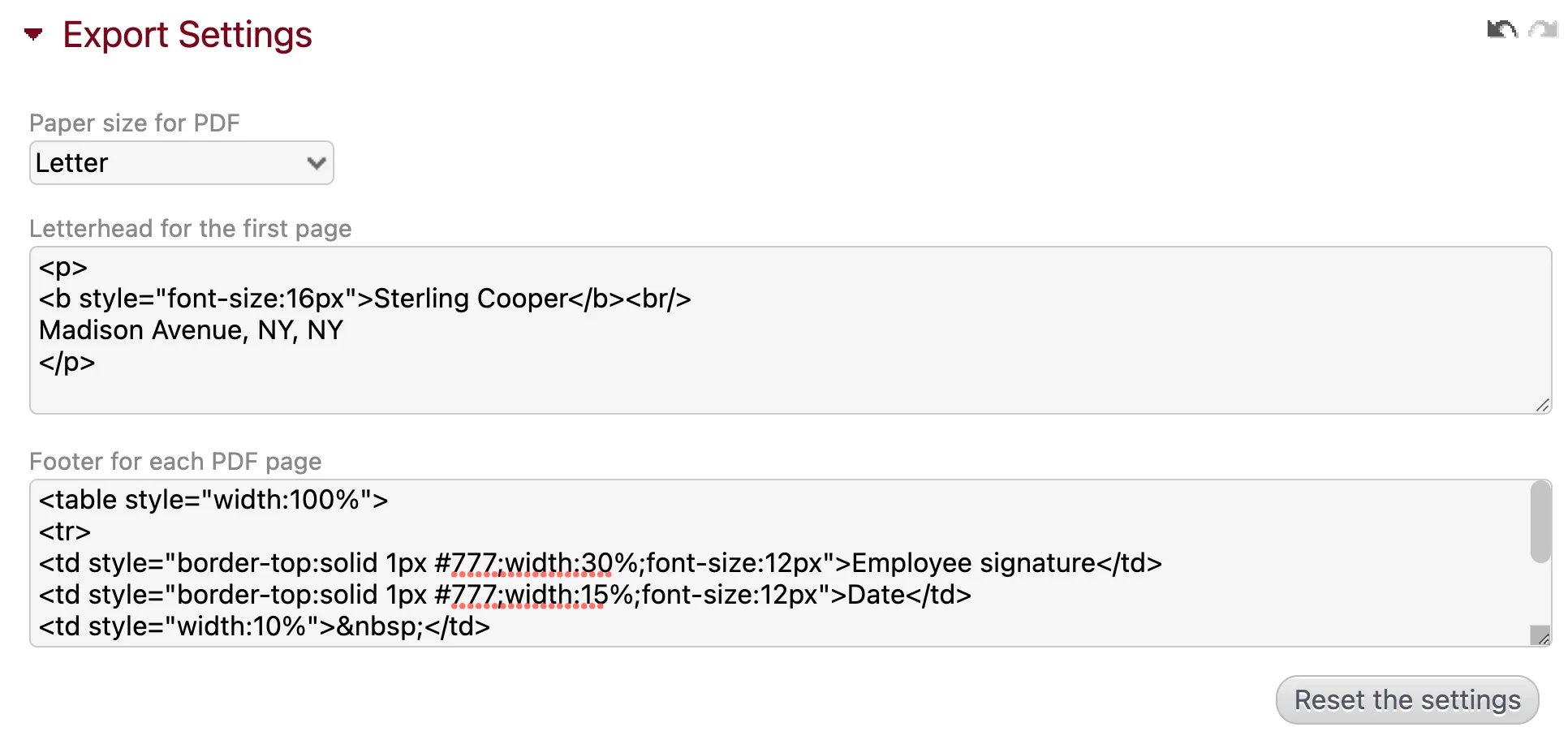
<b style=“font-size:16px”>Sterling Cooper</b><br/>
Madison Avenue, NY, NY
</p> If you want both the employee and the client to sign the printed timesheet, copy and paste the following example in the footer section: *<table style=“width:100%”> *
*<tr> *
*<td style=“border-top:solid 1px #777;width:30%;font-size:12px”>Employee signature</td> *
*<td style=“border-top:solid 1px #777;width:15%;font-size:12px”>Date</td> *
*<td style=“width:10%”> </td> *
*<td style=“border-top:solid 1px #777;width:30%;font-size:12px”>Client Signature</td> *
*<td style=“border-top:solid 1px #777;width:15%;font-size:12px”>Date</td> *
*</tr> *
</table>