Beebole’s reports turn tracked time, expenses, and planned work into answers about productivity, billing, costs, and budgets. Reports live in the Reports section of the sidebar, organized into folders, and they run on live data — every time you open a report, Beebole fetches the latest numbers.
Reports respect each person’s permissions. A report only ever shows the projects and people the viewer is authorized to see, based on their role.

Open the Reports section

Click Reports in the sidebar. The Reports menu on the left lists your report folders — click a folder to see the reports inside, or click New folder to add one.
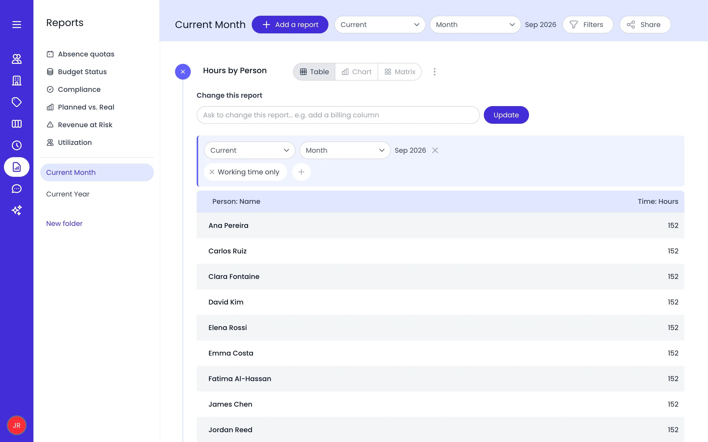
Beebole Reports section with the report folders on the left, the Current Month folder open with its period selector, Filters and Share buttons, and the Hours by Person report showing hours per person for September 2026

The Current Month folder with the Hours by Person report run as a table

Folders are personal: only you see the folders you create and the reports inside them, plus any folders other people have shared with you. Each folder carries three settings that apply to every report inside it:
  • A period: the date range the reports cover, chosen with the period selector next to the folder name.
  • Filters: conditions added with the Filters button that narrow the data for the whole folder.
  • A record scope: the Absence/working time setting, which switches every report in the folder to working time only, absences only, or both. Left unset, each report keeps whichever scope it was saved with.
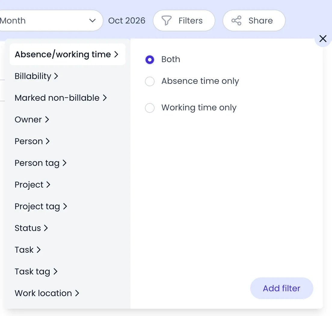
To set the record scope, click Filters, pick Absence/working time, choose a scope, then click Add filter.
Beebole report folder Filters menu with Absence/working time selected among the filter types, its three choices Both, Absence time only and Working time only, and the Add filter button

The folder's Filters menu open on Absence/working time

The folder’s filter button is highlighted whenever a filter or a record scope is in force, so it’s clear when the numbers you’re reading are narrowed.

Share a report folder

Reports are shared by sharing their folder. Open the folder and click Share next to its name, then pick who gets access:
  • People — select individual team members.
  • Tags — select a tag to include everyone tagged by it or its sub-tags.
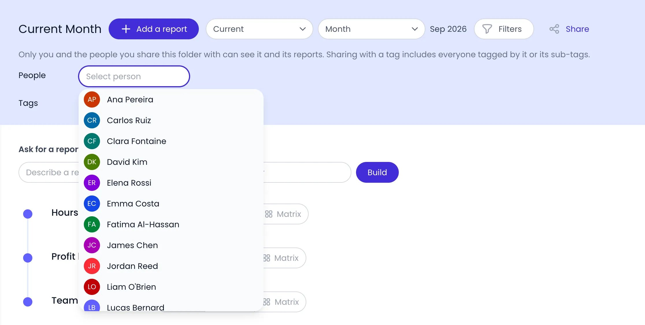
Only you and the people you share a folder with can see it and its reports. Shared folders are view-only for the recipients — they can open and run the reports, but the owner keeps full control over the folder and the reports inside. Click Share again to review or change who has access.
Beebole Current Month report folder with the Share panel open under the folder name, explaining who can see the folder, the People field open on a list of team members, and the Tags field below

The Share panel of a folder, with the People picker open

Sharing a folder never overrides permissions: each viewer still only sees the projects, people, and amounts their own role allows.

Sample reports in a new account

A new Beebole account starts with two sample folders with ready-made reports inside: Sample reports are regular reports — open them to see how columns and grouping work, then edit, duplicate, or delete them like any report you create yourself.

What reports can analyze

A report in Beebole is built on one or more record types: The columns you add to a report determine which record types it fetches — see Custom reports for how columns work. For time records, a report can also narrow its scope to Absences only or Working time only. Task records follow the report period day by day. A task is included when its dates overlap the period, even if it starts before the period or ends after it, and a task without dates is left out. Only the Planned hours of its days inside the period count. Beebole spreads a task’s planned hours over its owner’s work schedule, minus their time off, the same way the Gantt workload heatmap does. A Period column then divides them across the weeks or months the task covers. On task records, a Person filter applies to each task’s owner, and a project category column groups the tasks by the projects they are linked to.

Run a report

Click a report’s name in the folder to open it — Beebole runs it immediately and shows the results. Next to each report name, three buttons toggle how the results display:
  • Table — rows and columns, with sorting, subtotals, and a frozen header.
  • Chart — one of 11 chart types with configurable axes.
  • Matrix — a two-axis grid with a metric per cell and an optional heat map.

Beebole report header showing the Hours by Person report name with its close button, the Table, Chart and Matrix toggle buttons with Table and Chart active, and the report's more options menu

An open report with its Table and Chart views on and Matrix off

You can keep several views open at once. Beebole remembers which views each report uses — like every report setting, the choice is saved automatically. The Custom reports page covers building the output and using the chart and matrix views in detail.

Periods and filters

Set the period

The period selector next to the folder name controls the date range for every report in the folder. Choose a target — Current, Previous, Next, Year to date, Last 12 months, or Custom with explicit start and end dates — and, for the first three, a granularity: Day, Week, Bi-week, Semi-month, Month, Quarter, or Year.
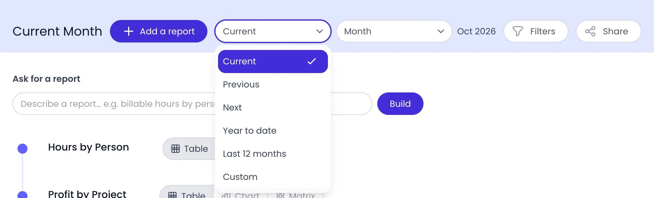
Beebole Reports header of the Current Month folder: Add a report, the period target list open on Current with Previous, Next, Year to date, Last 12 months and Custom, the Month granularity, Oct 2026, and the Filters and Share buttons

The period target of the Current Month folder, opened next to the granularity and the Filters button

A single report can override its folder’s period: open the report’s ⋯ action menu and click Period. To drop the override and follow the folder again, click Reset period in the same menu.

Filter the data

Add filters with the folder’s Filters button, or per report via the ⋯ action menu’s Filter entry. Available filter types: Filters combine, and each condition can include (is) or exclude (is not), except Approval status, which only offers is. Filter and period changes are saved automatically and the open report re-runs. To filter on a whole category, ⌘-click (Ctrl-click on Windows and Linux) the category itself in the Project or Task list instead of picking one entity — Beebole turns it into a Project category or Planning condition. What each filter actually covers is described in Custom reports. You can also filter on a status straight from the results. When a report shows the Status field of a Time column, click a status in that column to add it to the report as an Approval status filter. ⌘-click (Ctrl-click on Windows and Linux) adds it to the whole folder instead.
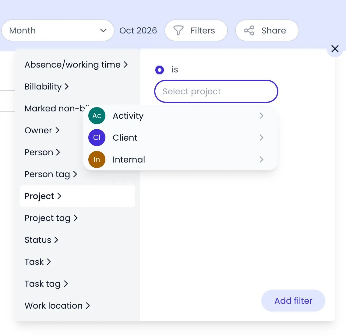
Beebole Filters popup of the Current Month folder, listing the filter types from Absence/working time to Work location, with Project selected, the is option checked, and the Select project list showing the Activity, Client and Internal categories, above the Add filter button

A folder's Filters with Project and is picked: the project list starts with the categories


The report action menu

Every report has a ⋯ action menu with its management actions: The action menu can also move the report straight into another folder — pick the destination from the Move to entry’s submenu (shown when you own another folder) instead of copying and pasting.
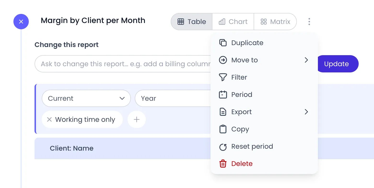
Beebole report Margin by Client per Month with its action menu open, listing Duplicate, Move to, Filter, Period, Export, Copy, Reset period and Delete

A report's action menu, next to its Table, Chart and Matrix buttons

For recurring spreadsheet workflows, see Data exports and the Excel add-in and Google Sheets add-on, which refresh saved report data from inside your spreadsheet.

Budget Status

When your subscription includes budgets and your role can view budgets, a Budget Status entry appears among the built-in reports at the top of the Reports menu. It lists every project that has a budget as a table — one row per project, with a progress bar for each measure you display. The solid bar is actual consumption, and a striped forecast bar extends it based on the planned effort of tasks linked to the project. Time logged on subprojects counts toward the parent project’s bars, and budgeted subprojects nest under their parent’s row — when two or more budgeted subprojects share a parent that has no budget of its own, Beebole adds a grouping row for the parent that sums their budgets. Controls at the top of the page: These controls all work on data the page already has, so the table re-orders and re-filters as you click — nothing is reloaded. The Filters cover the whole project hierarchy: filter on a client or a parent project and every project underneath it is included, and a project-tag filter also matches tags below the one you picked, plus every project under a tagged parent. Each condition can include (is) or exclude (is not). The chosen sort order applies at every level of the table — top-level rows, nested subprojects, and the per-person or per-project lines inside a split — and the project name breaks ties, so rows that read the same (all the untouched budgets at 0%, for example) keep a stable order. A budget consumed to exactly 100% counts as on budget: only a project projected above 100% is reported as over budget, and the bar colors use the same boundary.

Read the Budget Status table

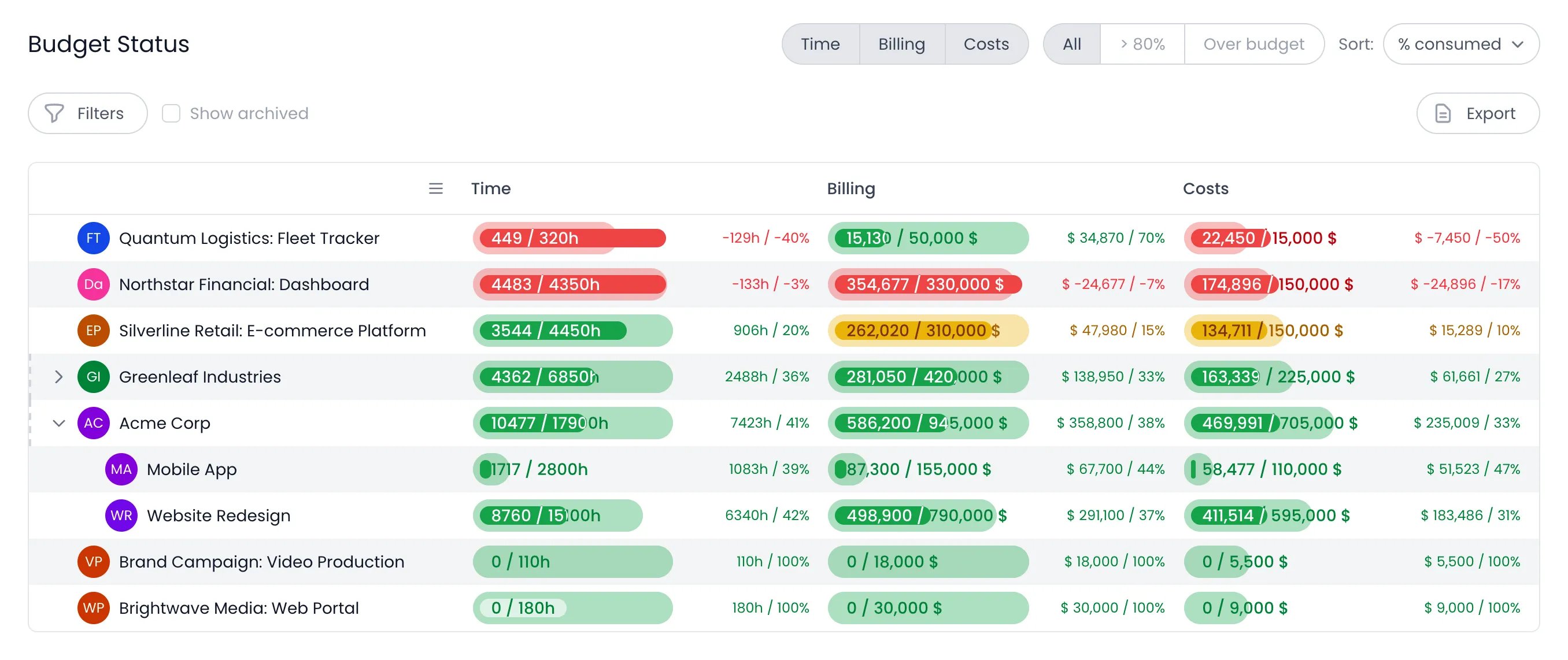
Beebole Budget Status report sorted by % consumed, one row per budgeted project with a Time, a Billing and a Costs column of progress bars, over-budget bars in red and an at-risk bar in yellow, the remaining amount and percentage beside each bar, Acme Corp expanded to Mobile App and Website Redesign, and the layout button at the left of the table header

Budget Status with Time, Billing and Costs in their own columns, and Acme Corp expanded to its budgeted subprojects

Each measure you turn on — Time, Billing, Costs — gets its own column, headed by its name, so a column reads top to bottom across projects. To read a project’s measures as one block instead, click the layout button in the table header, just before the first measure column — its tooltip reads Stack the measures in one column. The bars then sit one under the other in a single column. Click it again (One column per measure) to go back. Beebole remembers your choice, so the report reopens in the layout you left it in. The numbers sit in the row itself:
  • Inside each bar, the amount consumed against the budget — for example 120 / 200h for time, or the logged and budgeted amounts in your currency for billing and costs.
  • To the right of each bar, what is projected to remain once the planned effort still to come is spent, as an amount and as a percentage of the budget.
  • Hover a bar to see the name of its measure and the Planned effort behind its striped forecast.
Bars are scaled so that related rows can be compared at a glance: a subproject’s bar, or a line inside a split, uses the same scale as its parent row, so a shorter bar really means a smaller budget. When Billing and Costs are both shown, the two money bars share one scale as well, while Time keeps its own. A chevron marks a row that has budgeted subprojects or a split — click the row to expand it. Choosing the > 80% or Over budget filter expands every parent holding a matching row automatically, so a project in trouble is never hidden under a collapsed parent. Archived projects appear with a hatched background when Show archived is on. When no project carries a budget, or your filters exclude every budgeted project, the table reads No projects with budgets found. On a budget split by person or by project, each line compares its own allocation with the time and money really logged against it — a split-by-project line also counts everything logged on that project’s own subprojects. A project carrying several budgets appears as a single row: the targets add up, and its actual consumption is counted once. On a phone, the report keeps the status filter and shows one card per project, with a colored edge for the project’s overall status. Tap a card to open the numbers behind its bars. This report is where budget trouble surfaces: it always flags projects approaching or over their budget, and there is no setting to switch on. The striped forecast bar carries the planned effort still to come, so a budget heading for an overrun shows it before the actuals get there. See the Budgets page for how budgets are set.

Planned vs. Real

Among the built-in reports, the Reports menu also offers Planned vs. Real, a chart comparing the work you planned with the time actually logged, period by period.
1

Pick the plan

Pick the plan to chart with the Plan dropdown — shown when your account has more than one planning. The plan’s tasks form the planned side.
2

Choose who or what to chart

The chart shows one person or one project at a time. The first button picks what you step through: People, or a level of a project category such as Client. Next to it, pick the person or project from the list, or use the arrows on each side to move to the previous or next one.
3

Choose the unit and view

Pick the Unit the chart reads in: Hours, Days, Billing, Cost, or Margin — money is shown in your organization’s currency. Under View, switch between Cumulative (the running total) and Remaining (a burndown toward zero).
4

Read the chart

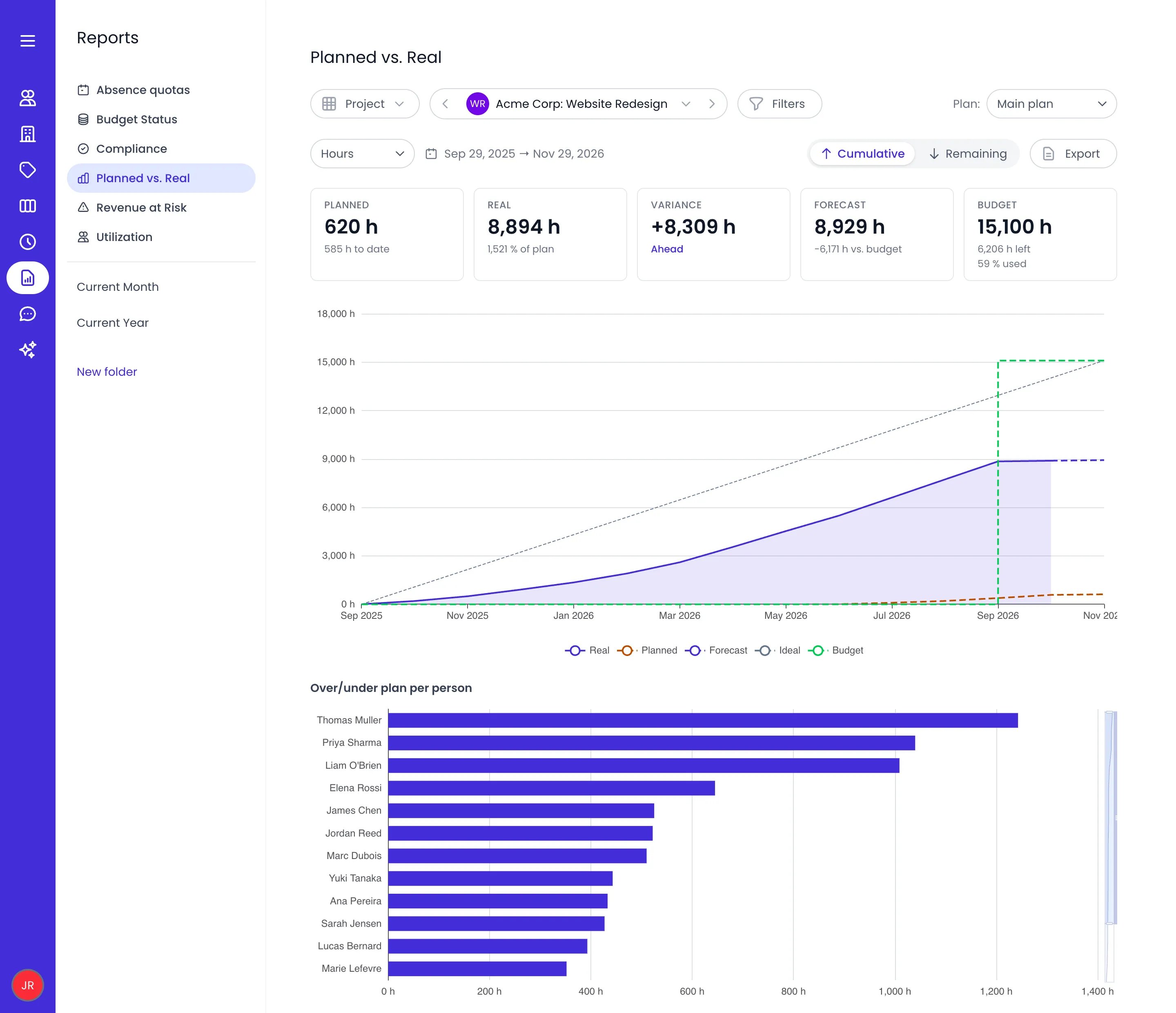
Planned is the tasks’ planned effort, distributed across the scheduled days between their dates. Real is the timesheet time recorded on the projects those tasks belong to — the same scope the Budget Status report uses. A Forecast carries the remaining planned effort forward from today’s actuals, an Ideal line shows the steady pace that would land exactly on plan, and a Budget line appears where a budget is set. A headline states the pace at a glance: Behind, On track, or Ahead.
5

Check who is over or under

The Over/under plan per person chart breaks the variance down by person, showing who is running over or under their planned time in the selected period.
6

Narrow and export

Use Filters to focus on specific people, projects, or tags, and Export to download the results.
Beebole Planned vs. Real report for the Acme Corp: Website Redesign project on the Main plan, in Hours and Cumulative, with the Planned, Real, Variance, Forecast and Budget figures, the chart of the Real, Planned, Forecast, Ideal and Budget lines from September 2025 to November 2026, and the Over/under plan per person bars below

Planned vs. Real for one project, cumulative, in hours

Your chosen plan, unit, and view are remembered per user, so the report reopens the way you left it. Use it to catch plans drifting from reality early — a Real line running above Planned means the work costs more time than scheduled. Plan the work itself in the Gantt and Staffing views.

Revenue at Risk

The Revenue at Risk entry in the Reports menu answers one commercial question: which hourly or daily-billed projects will not consume their contracted hours before their end date? Unused budgeted hours on a time-and-materials contract are revenue that is lost when the contract ends — this report surfaces them while there is still time to act. For every project with a budget, a billing method of Hourly or Daily, and an end date, the report projects consumption to the end date and lists what will be left over: On screen, the end date shows under Projected at end and the implied rate under Revenue at Risk. Logged is in the export only.
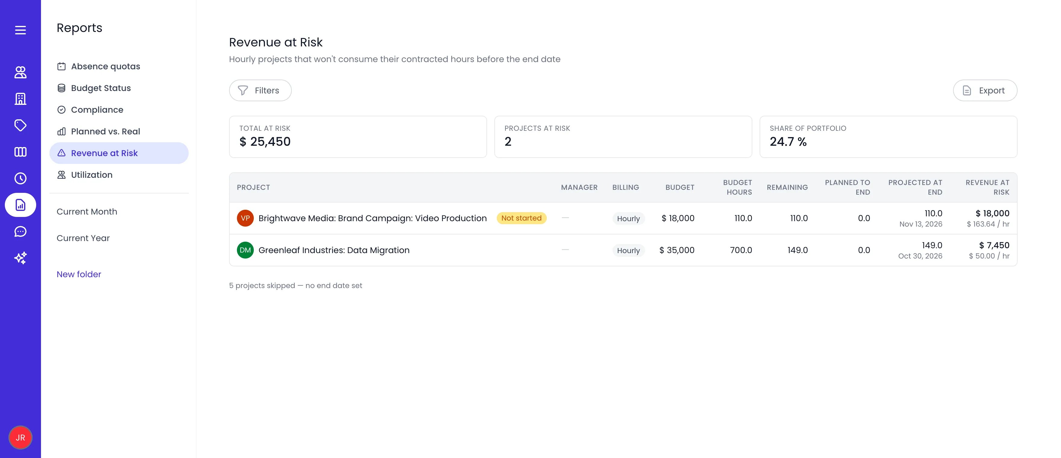
Beebole Revenue at Risk report showing Total at risk of $25,450, 2 projects at risk and 24.7% of the portfolio, with rows for Video Production, flagged Not started, and Data Migration, each with its budget, budget hours, remaining hours, projected hours at the end date and revenue at risk

The Revenue at Risk report with two hourly projects that will not use their budgeted hours by their end date

Totals at the top summarize the portfolio: Total at risk, Projects at risk, and Share of portfolio. Rows where nothing has been logged yet are flagged Not started. Projects the report cannot assess are counted separately below the table — those with no end date set, and those whose budgets mix currencies. The report appears when your subscription includes budgets and your role can view budgets and billing rates, and it supports the standard Filters and Export controls.

Utilization

The Utilization entry in the Reports menu shows billable hours as a share of scheduled capacity, per person and month. Use it to see how much of each person’s available time turns into billable work.
  • Each row is a person; each column is a month, showing their utilization percentage. Billable hours are the hours logged on billable work; Capacity hours are the person’s scheduled working time, net of time off — so a 30-hour week or a vacation doesn’t unfairly lower the score.
  • A Projected column estimates next month from the person’s planned bookings on billable projects.
  • An Average summarizes each person across the period.
  • Filters and Export work as in other reports.
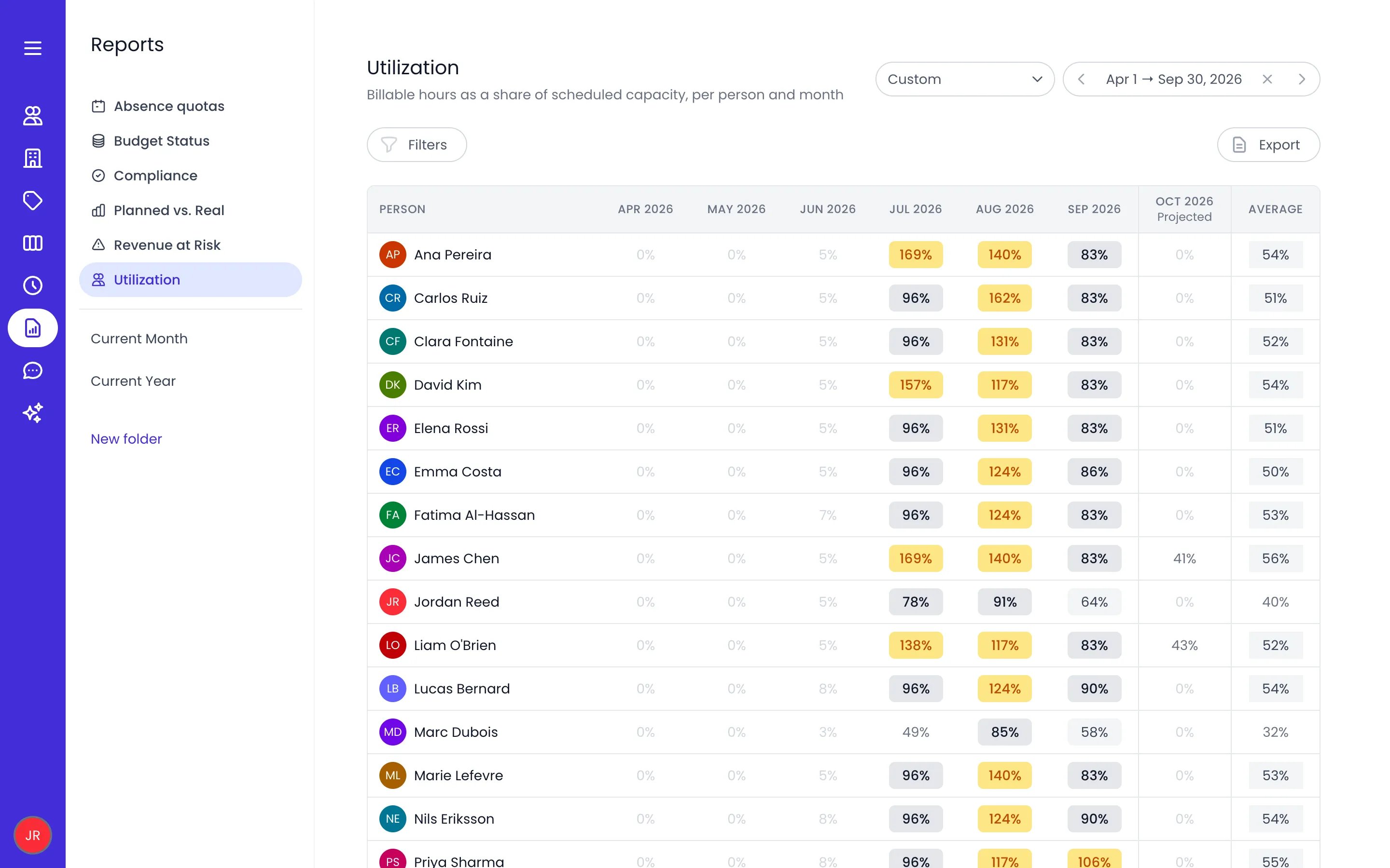
Beebole Utilization report from April to September 2026, with one row per person, a utilization percentage per month highlighted when above 100%, a Projected column for October 2026, and an Average column

The Utilization report, one row per person and one column per month

The report appears when your subscription includes budgets and your role has the Billable utilization permission.

Timesheet Compliance

The Compliance entry in the Reports menu shows whether each person submitted their timesheet on time, late, or not at all — per person and period, in a calendar-style grid. It is also where you see each person’s timesheet score, the 0–100 measure of how reliably they submit.
  • Each row is a person with their compliance Score; each column is a timesheet period, marked On time, Late, or Not submitted.
  • Hover a cell for the details: the period’s Deadline, when it was Submitted, Days late, and Rejections.
  • Rows sort worst-first by default, so the people needing attention surface at the top.
  • Filter by person or person tag, and change the date range — the report defaults to the last six full months. Export downloads the grid.
  • People who have never recorded time are counted separately in a footnote — the timesheet process has not started for them, so they aren’t shown as non-submitters. Click the people count in the footnote to expand the list of exactly who hasn’t started tracking time.
  • People without an approval workflow don’t appear at all. They can’t submit a timesheet, so there is nothing to measure and they have no score.
Access is a dedicated permission: your role needs Timesheet compliance, and managers see the people they manage — admins see everyone. See Roles & authorizations.

Absence quotas

The Absence quotas entry in the Reports menu gives managers one consolidated view of everyone’s time-off allowances — no more opening profiles one by one. Rows are grouped by time off type, and each row is a person’s allowance for that type. Each group’s header shows the time consumed against the total allowance and what is Remaining. The columns you can show are Start – end, Valid until, Carry forward limit, Allowance, Consumed, Accrued, and Allow negative balance.
  • Timeline — Switch to the timeline to see consumption over the allowance’s period instead of totals.
  • Open a row to see the detailed breakdown behind its numbers.
  • Columns, Filters, Show archived, Export — Choose the visible columns, narrow by person or tag, include archived people, and download the results.
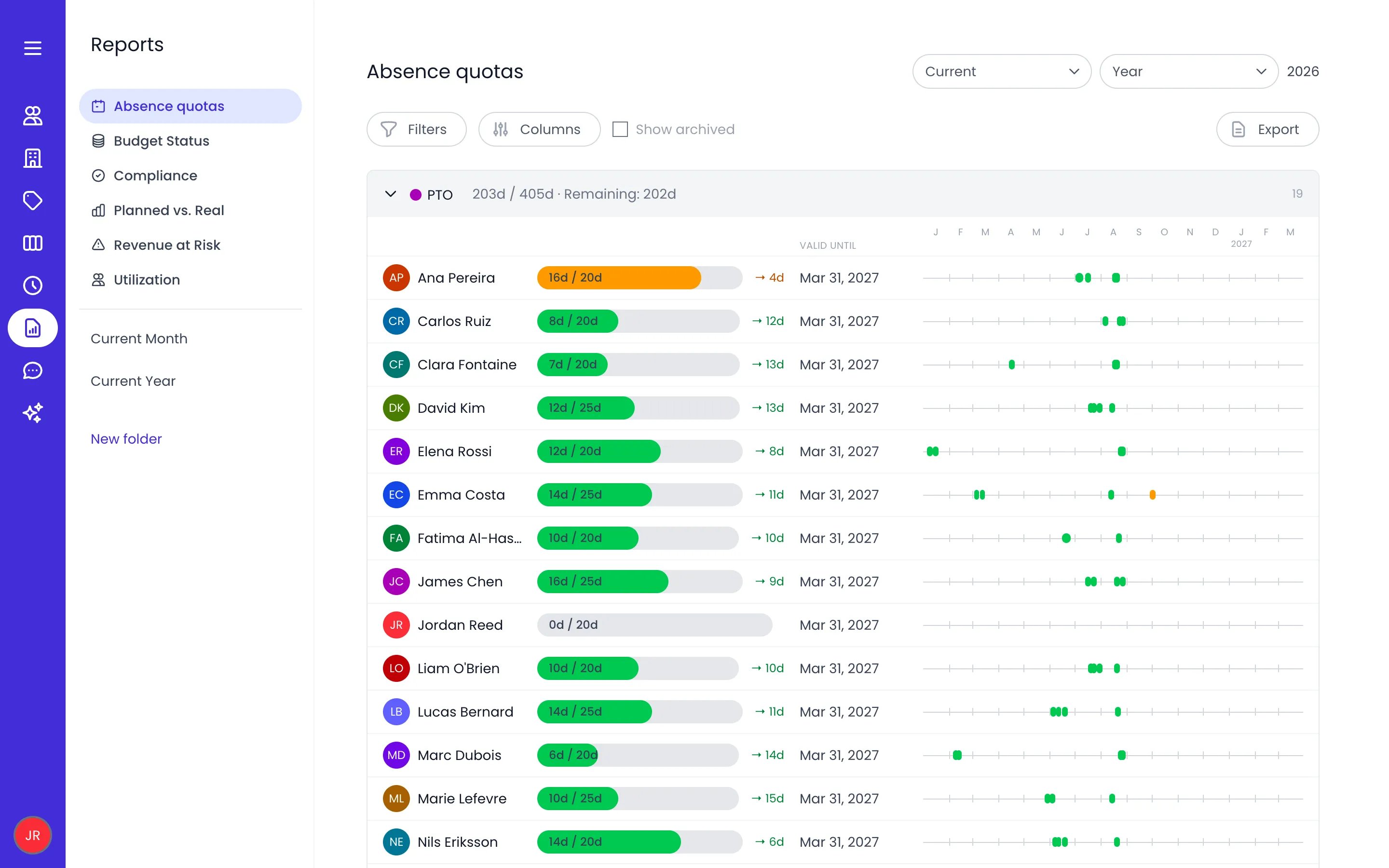
Beebole Absence quotas report for 2026 showing the PTO group with 203 of 405 days taken, one row per person with a bar of days taken out of the allowance, the days remaining, the Valid until date, and each person's absences on a timeline of the months

The Absence quotas report for the current year, grouped by time off type

The report appears when your subscription includes absence quotas and your role can view absence quotas. Balances follow the same rules as the allowances themselves — see Time off.

Reports on your phone

On a phone, the Reports section switches to a layout built for consulting: pick a folder, adjust the period, and read each report as a scrollable sheet. Filters and the period selector work as chips at the top of the screen.
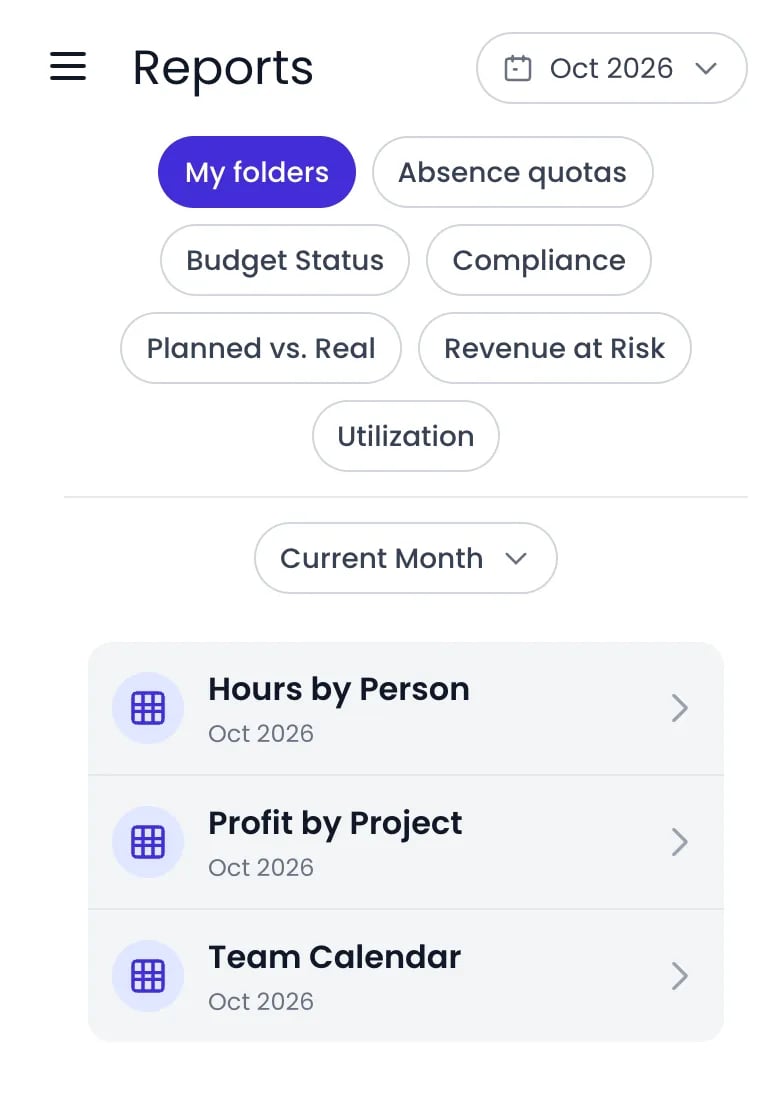
Beebole Reports on a phone with the Oct 2026 period chip at the top right, chips for My folders, Absence quotas, Budget Status, Compliance, Planned vs. Real, Revenue at Risk and Utilization, the Current Month folder picker, and cards for the Hours by Person, Profit by Project and Team Calendar reports

Reports on a phone: the folder and period chips above the Current Month folder's reports

Building and reconfiguring report output remains a desktop task — for example, an unconfigured matrix view asks you to open the report on desktop to pick its rows, columns, and metric.

Custom Reports

Build report output with columns, grouping, charts, and the matrix view.

Budgets

Set billing, cost, or hours budgets on projects and track them against targets.

Data Exports

Download report results for offline analysis and sharing.

Cost Rates

Configure cost rates so cost and profit columns show data in reports.

Frequently asked questions

Yes. A new Beebole account starts with two sample folders — Current Month and Current Year — containing five ready-made reports, including Hours by Person and Profit by Project. They are regular reports you can run, edit, or delete, and they double as examples for building your own.
Yes. In Beebole, absences are time records, so any time-based report can include them. Add an Absence type column to break results down by leave type, or narrow a report to Absences only — the sample report Absences by person shows this setup.
Beebole exports report results as JSON, CSV, TSV, Excel (XLSX), or PDF, plus the chart as a PNG image and the matrix view in CSV, Excel, or PDF. For spreadsheets that refresh themselves, connect a saved report to the Excel add-in or Google Sheets add-on.
Reports show hours as decimal numbers, whatever Duration format your timesheet uses. A timesheet in hours and minutes shows 3:15, and a report shows the same time as 3.25; 7:20 becomes 7.33. The totals are the same, only the notation differs. See Duration format.
Yes. Beebole’s Budget Status report is a table with one row per project and a column for each measure you turn on — Time, Billing, and Costs. Click the layout button in the table header to stack the measures in one column instead, so each project’s bars read as a block. Beebole remembers the layout you pick.
For each hourly or daily-billed project with a budget and an end date, Beebole projects how many budgeted hours will still be unconsumed at that date, then converts them to money using the budget’s implied rate. The Revenue at Risk report totals this across your portfolio so you can rebalance staffing before contracted hours expire unused.